Legacy Simplification Program (LSP)
Revitalising the commercial insurance industry with technology.
What is LSP?
The Legacy Simplification Program (LSP) aimed to simplify and standardise the products, processes and policy applications used across the many insurance brands that make up Suncorp.
My role
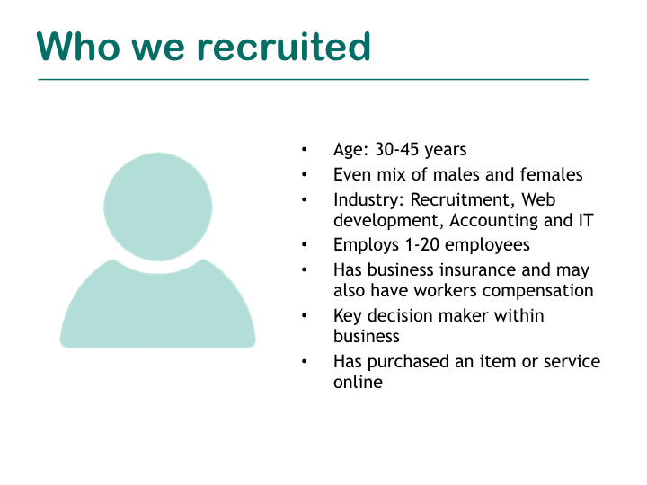
I was paired up with a consultant to conduct research around commercial insurance customers, creating personas and user journeys. This then progressed into developing an occupation look-up tool that allowed users to search for an ANZSIC (Australian and New Zealand Standard Industrial Classification) code based on specific search criteria.
Customer research
As part of the program of work some time was dedicated for customer research. This entailed interviewing customers and analysing survey responses to get a picture of various touch points that our customers have with our products and services. The outputs fed into the creation of Personas and Customer Journey Maps of various user segments. This design activity assisted the delivery teams and product owners in understanding the behaviour, goals and purchasing decisions of our customers. It also helped to identify specific opportunities to improve our service to our customers and shape user stories for estimation and prioritisation.
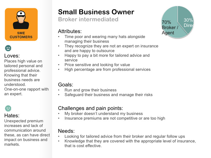
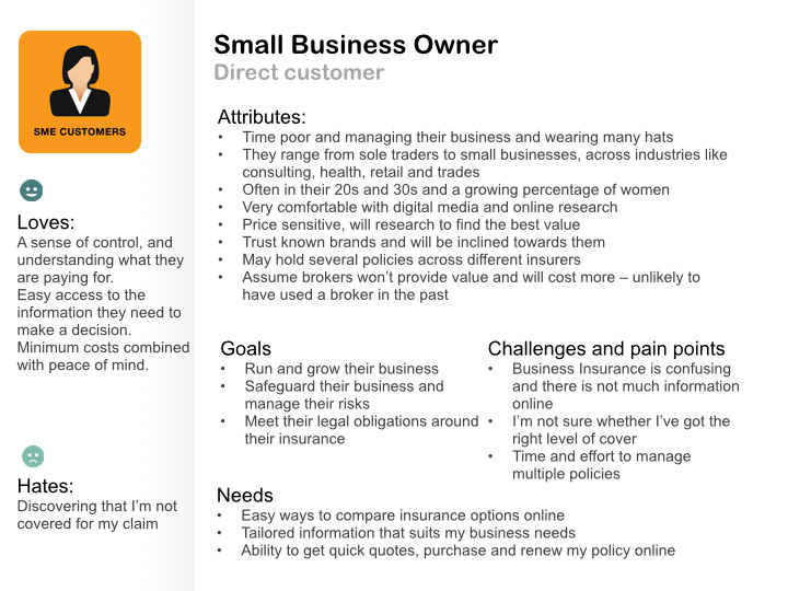
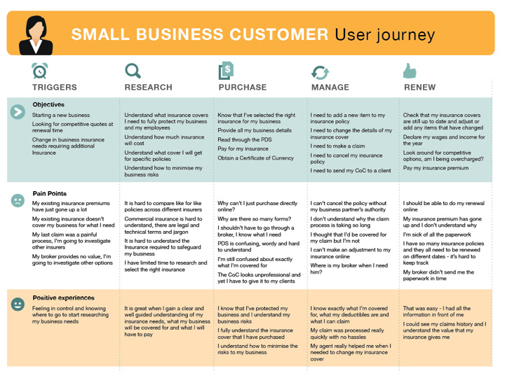
Personas and journey map created from customer research.
Occupation lookup tool
March 2013 – July 2013
Overview
The Commercial Insurance business had multiple occupation lists in use across their application landscape. This is a big issue that the insurance industry as a whole had been facing for a long time as all insurers use different lists making it difficult for intermediaries and staff to know which code best describes the core function of business customers. The purpose of the Occupation Lookup tool was to provide a consistent and accurate view of the various occupation data sets, removing the need for paper folders to exist and gather dust on peoples desk.
Discovery
To understand the problem space and analyse the current state we had a look at our existing applications as well as competitor solutions.
Collaborative design workshop
The workshop involved the business and subject matter experts (SMEs) alongside members of the delivery team. We began the workshop by running through the Discovery work that had been completed. The room was then divided into two, with each group taking on a persona of either a direct or intermediary customer.
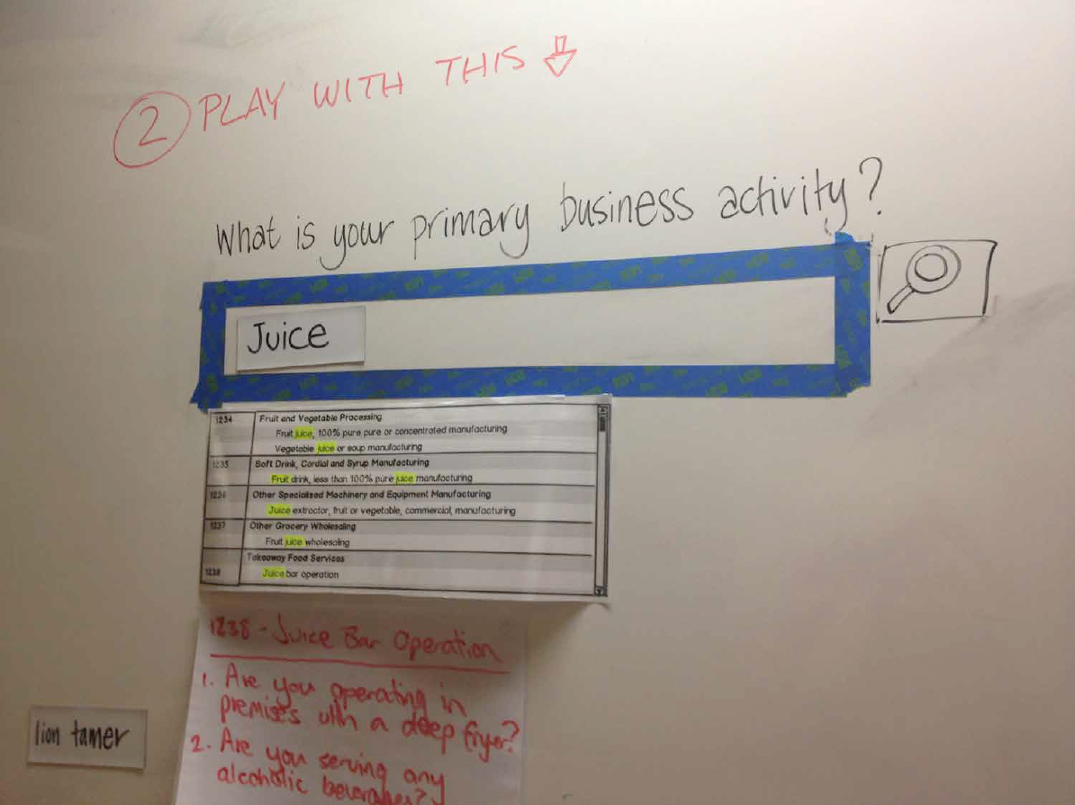
Interactive, incentivised design wall
As another way of sourcing ideas, we set up an interactive design wall on a whiteboard with high foot traffic.
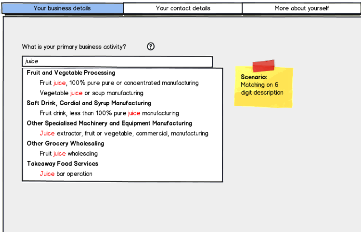
Wireframes
The outputs from all of the design activities were then consolidated into Balsamiq wireframes.
The final product
The first release of the occupation lookup tool was developed for internal use only, used by underwriters and contact centre staff. The tool was launched to improve accessibility, consistency and accuracy with using ANZSIC data. The work done for direct customers was saved for future initiatives with the intention of reuse. Since its release, the tool has received strong feedback from its business users.
"I find this to be a very friendly tool now accessible to all users which provides invaluable information at the touch of a button."
"I think the best attribute of the tool is that it allows us to work in a faster way [...] it's very easy to use, and we can get a result instantly."
Workers compensation
March 2014 – November 2014
Overview
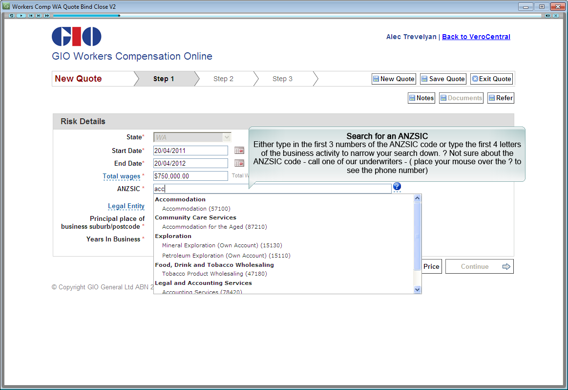
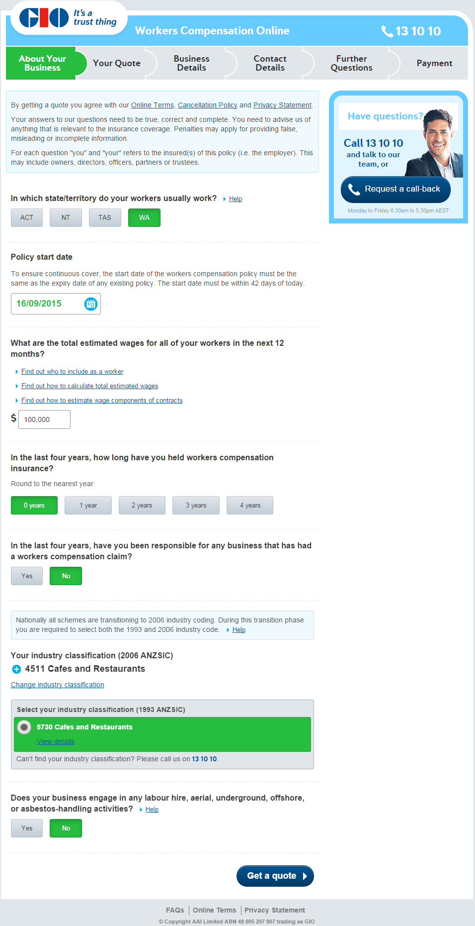
The first cab off the rank for LSP was a direct customer offering of Workers Compensation (WC) for underwritten states. WC is insurance to cover a business' employees in the advent of an injury or disease that occurs at work. WC Direct Online will provide businesses with an online quoting capability portal for small and medium enterprise customers in underwritten states who meet key criteria.
The team and my role
Our delivery team in the Digital stream of work consisted of about 9 developers, 2 testers, 2 Business Analysts (BA's), 2 UX designers and an Iteration Manager (IM) across Australia and China. I partnered with a fellow UX Designer to take charge of the UX work for the digital stream. Activities ranged from facilitating design workshops, analysis and mind-mapping, wireframing and prototyping, running usability tests to writing requirements and pairing with developers. We worked closely with a WC business subject matter expert (SME) and members from the commercial insurance digital distribution team.
Workshopping
We kicked things off by holding a design workshop with the goal of having the entire screen flow and question set nailed down. The workshop involved members from the project delivery team, digital distribution, call centre staff and representatives from the program delivery level. We wanted to ease everyone into the design jam by having various activities leading up to the sketching exercise.
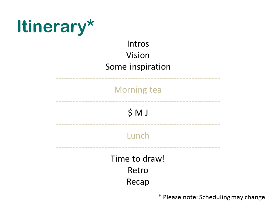
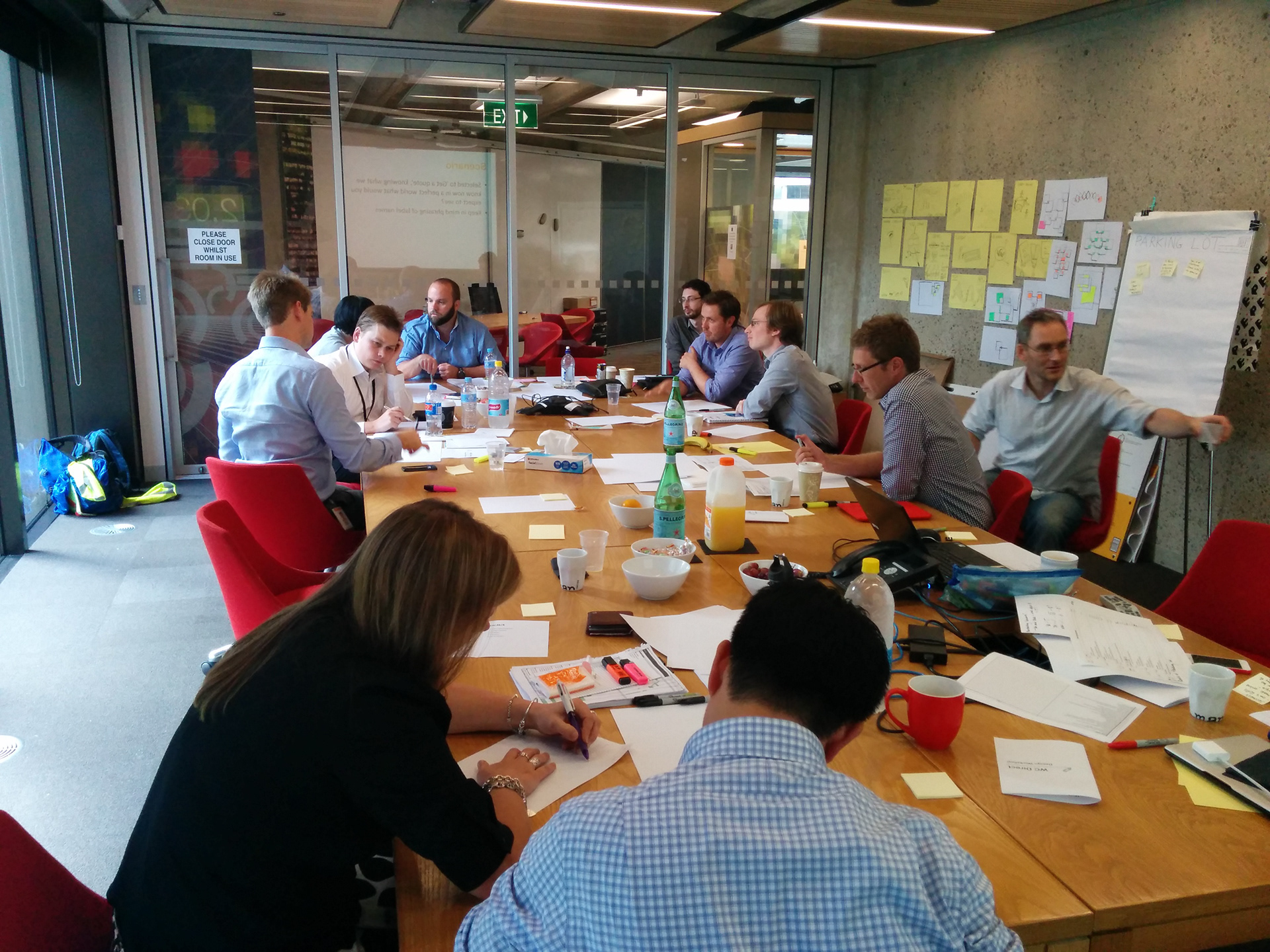
Overall the day ran smoothly and brought to light pertinent questions that needed immediate attention. We weren't as strict as we should have been with time, letting valuable conversations play out, and so the latter part of the day felt rushed, despite this we came out with a lot of ideas. The sketches from the workshop we then distilled into two distinct screen flows that were then iterated upon with a subset of the attendees.
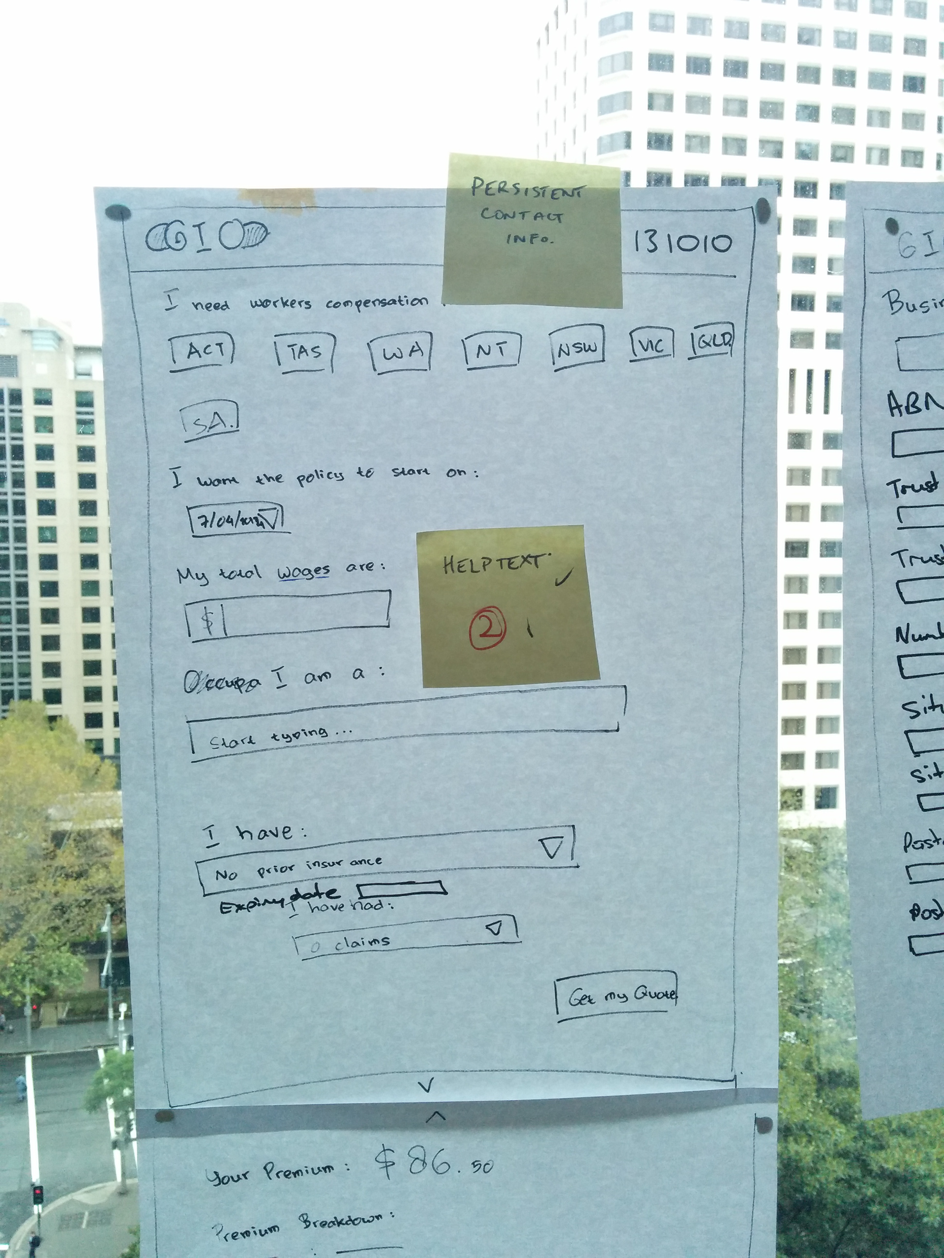
The approach
When designing the entire flow, the principles that defined our approach were "quick to price" and ask questions from "easy to hard". This guided the way we grouped and laid out the questions. Using pen and paper to sketch with initially, if there were any tricky interactions that needed to be figured out we would flesh them out on the whiteboard. These would then be translated into Balsamiq mock-ups attached to the relevant JIRA card. This helped with version control and in collaborating with the BA's, developers and testers on requirements.
For the look and feel of the application, we had the advantage of having an existing corporate style guide to follow. This helped immensely in both the design and development of the various components.
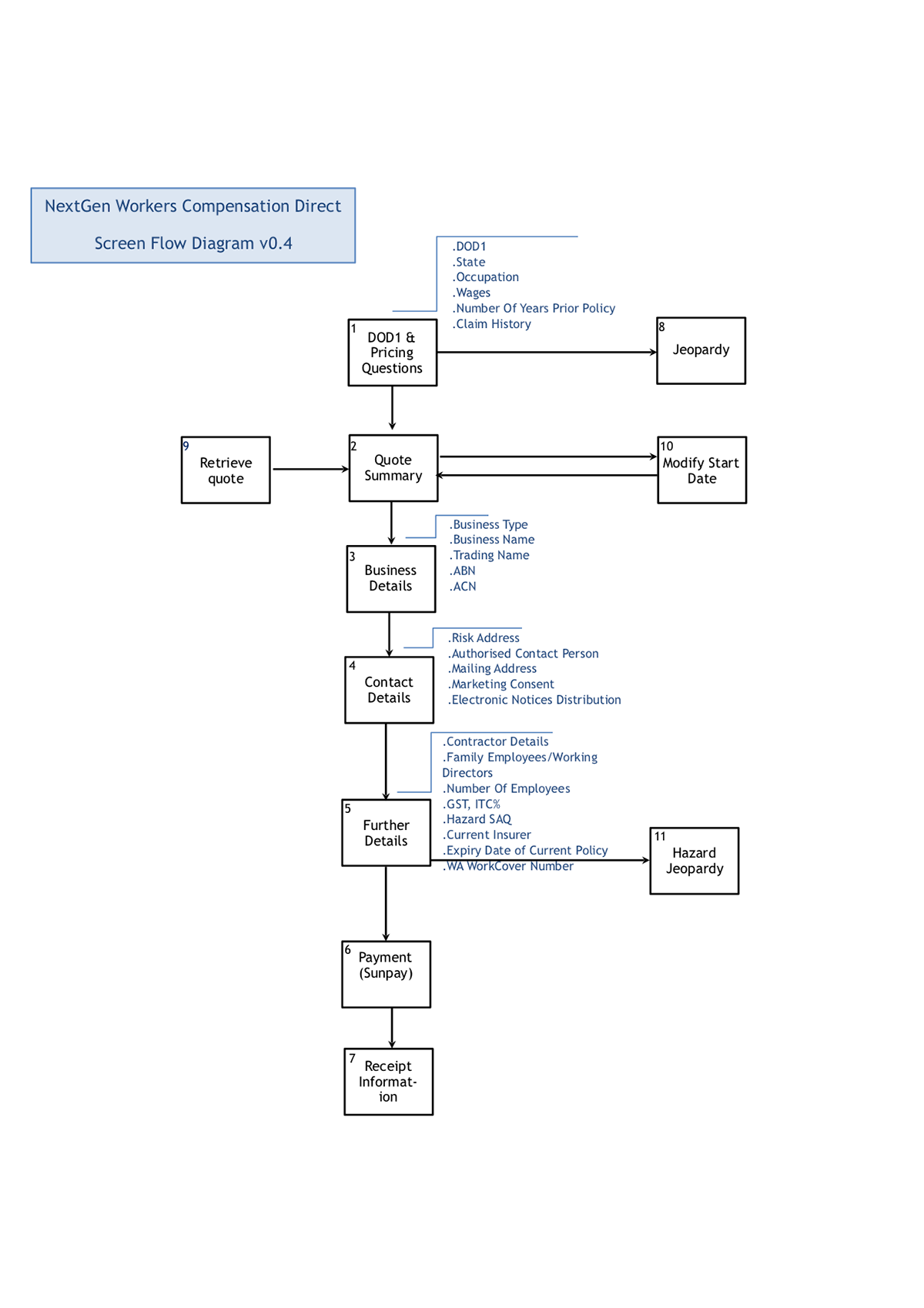
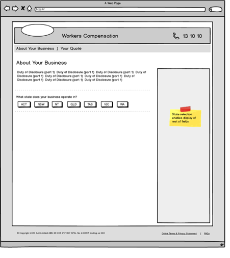
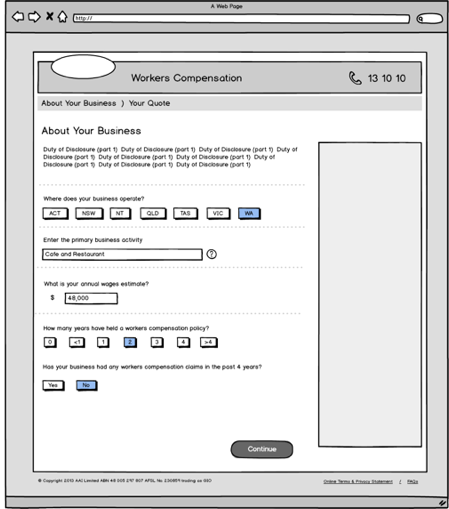
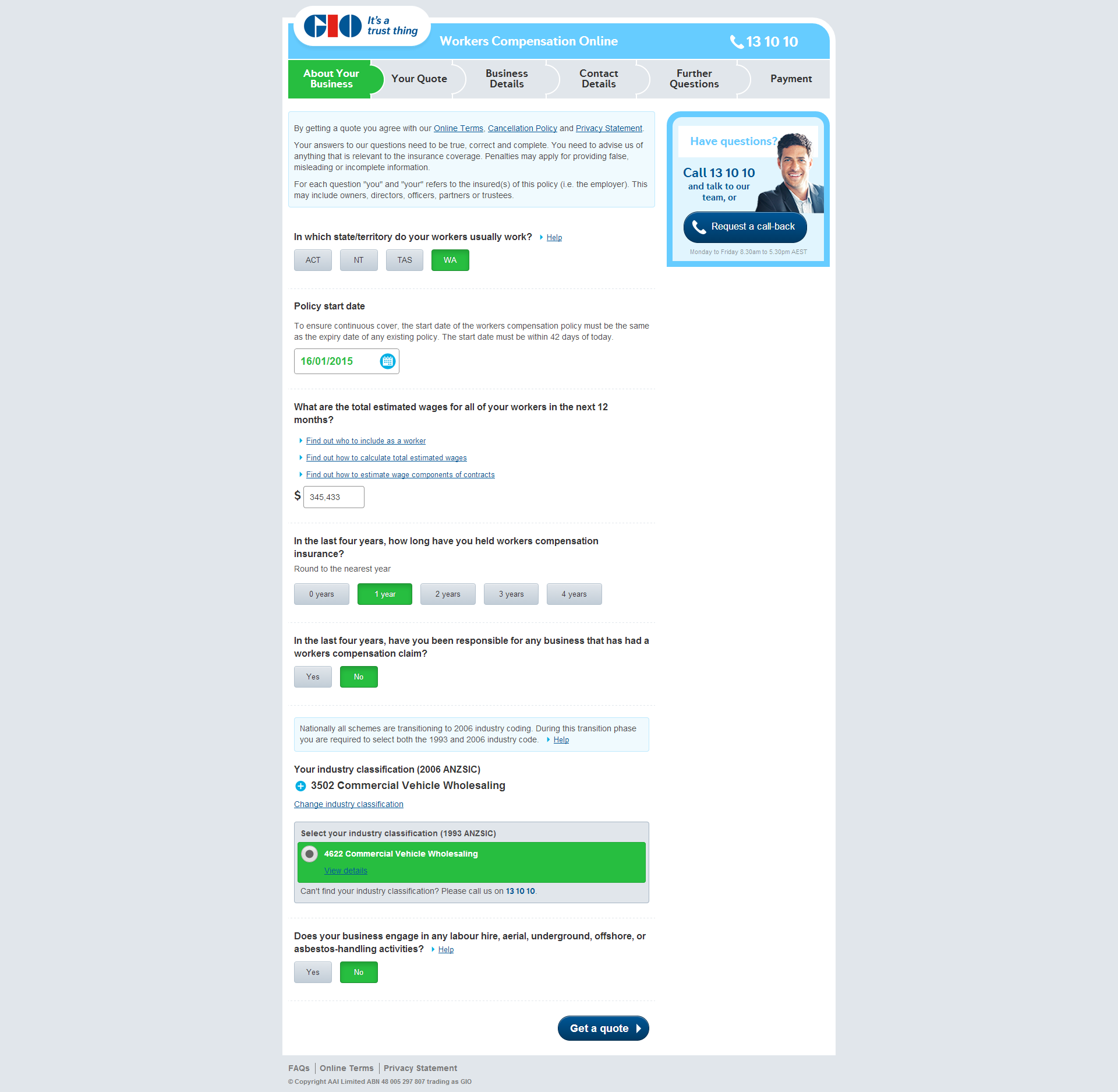
Evolution of the design — from sketch to wireframe to production
Adopting the occupation lookup tool for direct
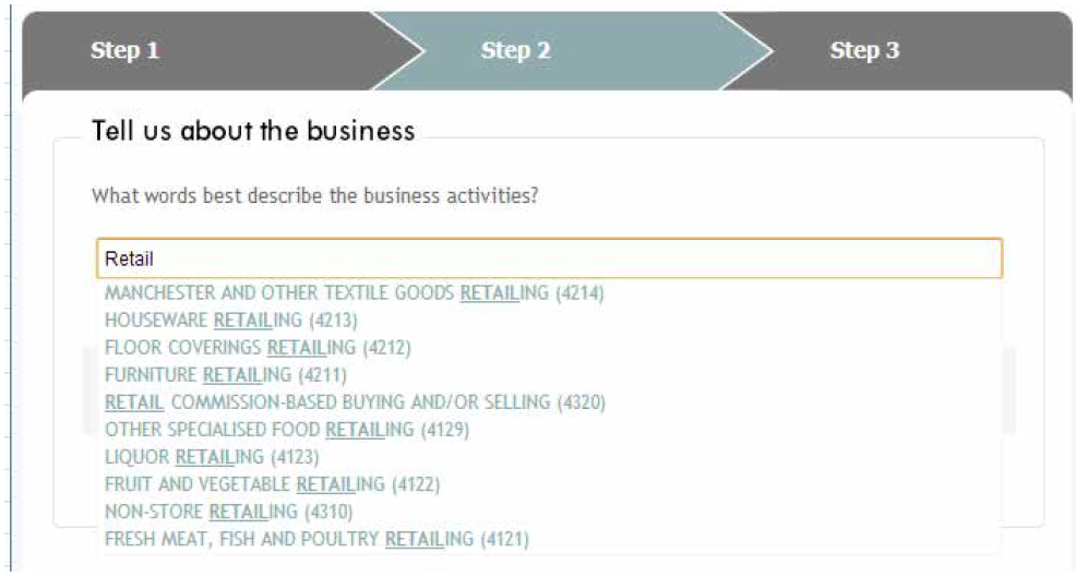
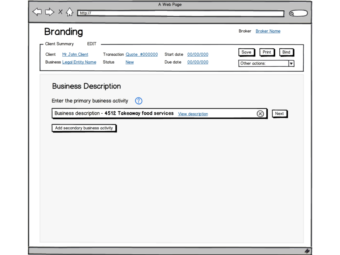
Having previously delivered the occupation search tool for internal customers our challenge was to adapt this for direct customers.
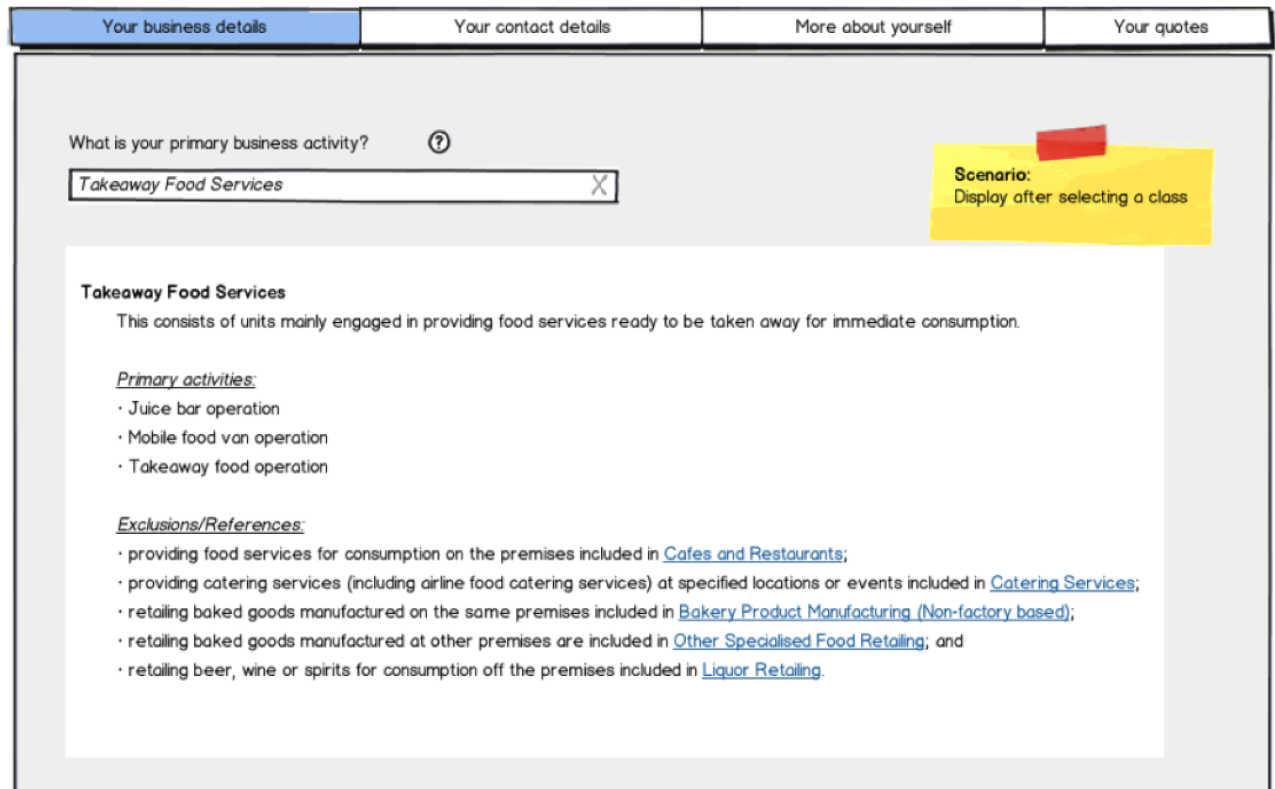
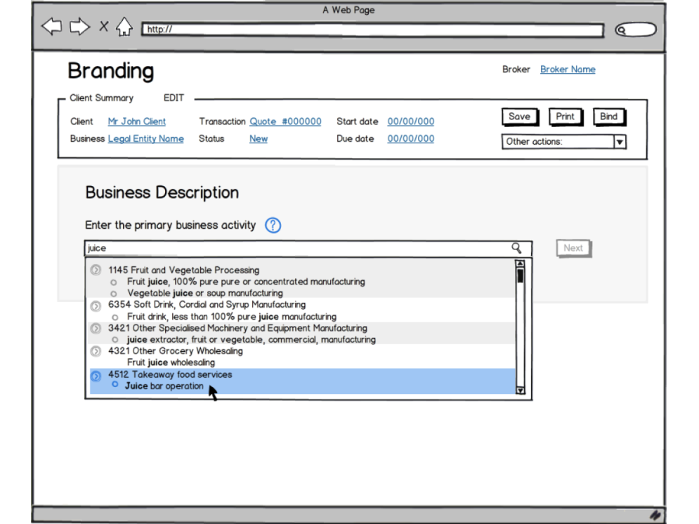
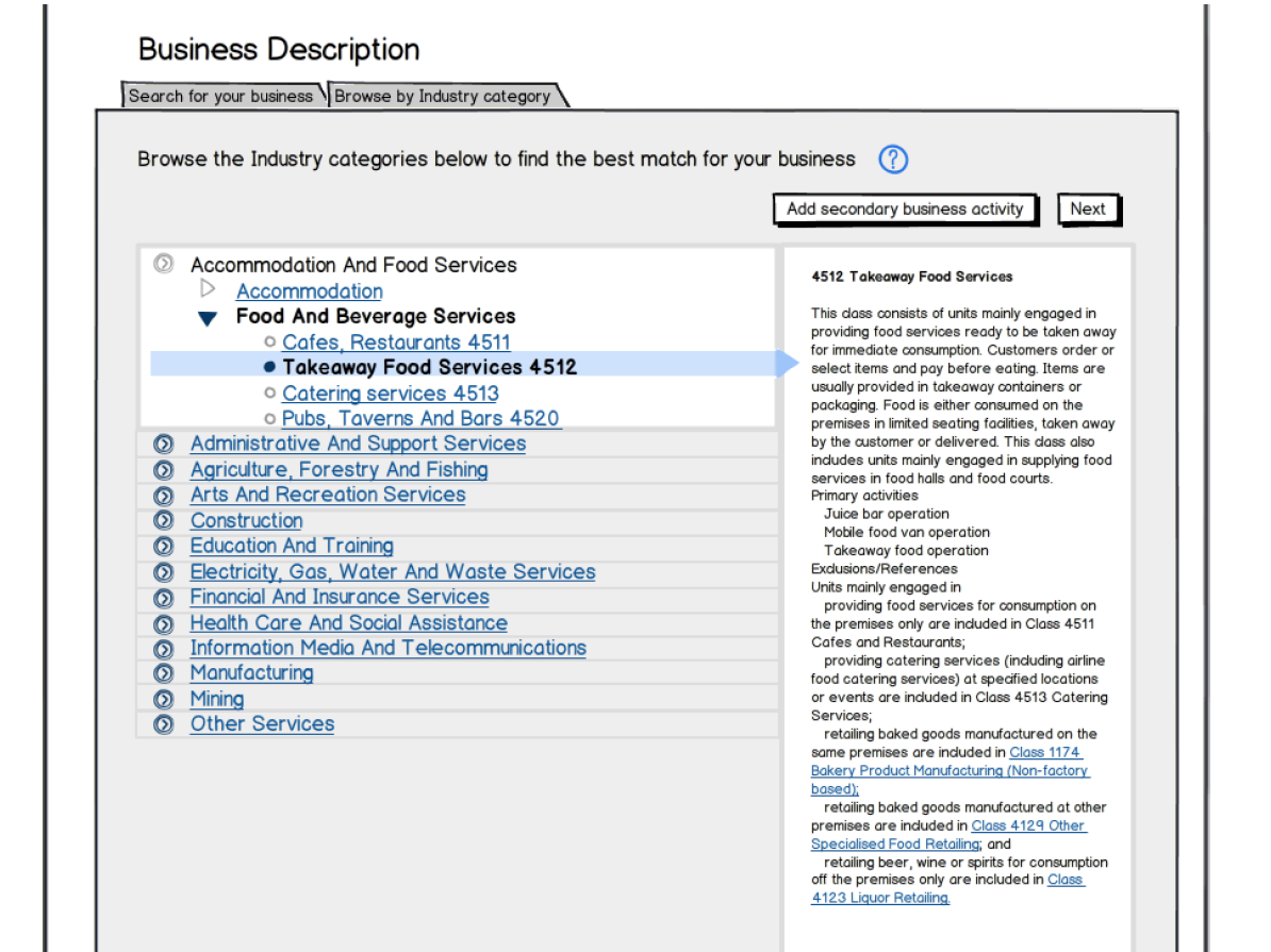
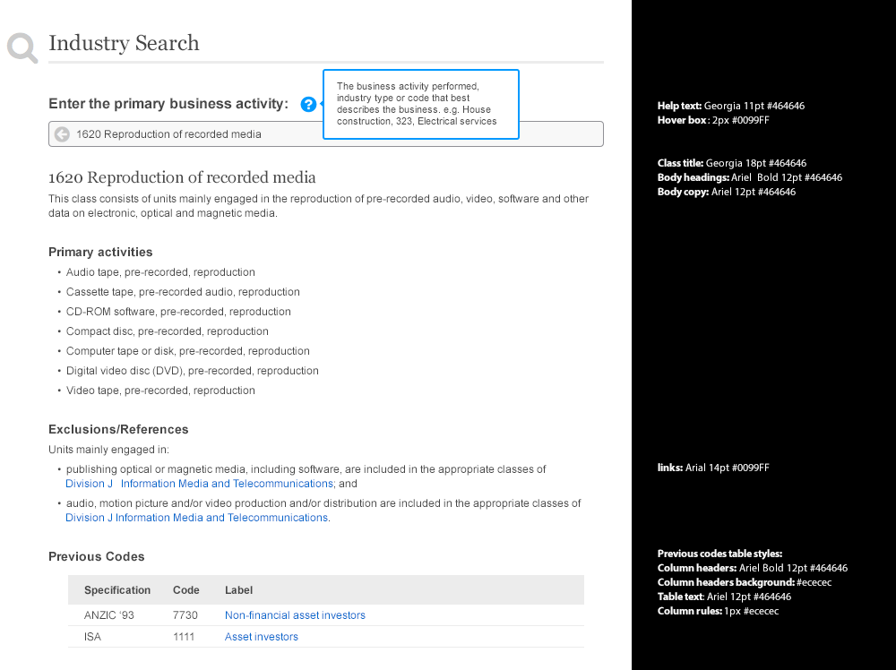
One of the main changes we proposed was to make the choice of ANZSIC more deliberate; that is to discourage "near enough is good enough thinking". At the same time we wanted to make the results better, more relevant, more attuned to how customers think and talk about their business. And so, we looked at a couple of things, changing the order of the way results are presented, promoting the best match to the top of the search list; increasing the matching potential of searches by various means, for example adding keywords and defining customer-friendly names.
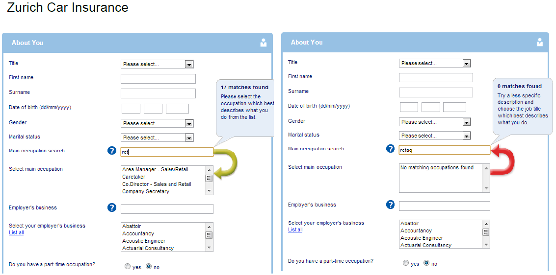
In the pursuit of these ideas I was playing around with the ANZSIC search on the Australian Bureau of Statistics (ABS) site and found that for the same search term it returned more results than our current search tool and that some of the results were activities not found on the list of primary activities nor in the detailed description. With a bit of digging around we managed to obtain a copy of the ABS index file, enriching the data set and increasing the chances of matching the customer's search term with an entry in our tool. Taking into consideration the time we had left and other constraints, we produced the following wireframes.
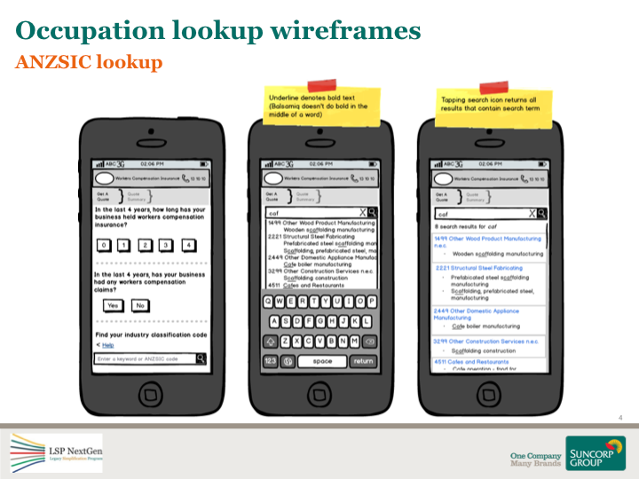
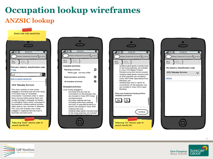
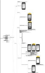
For this particular feature, having previously worked on the lookup tool, I took on the role of BA as well as UX. This entailed analysing and writing requirements into a mind map, holding elaboration sessions with testers, developers and SMEs as well as pairing with developers for styling and interaction design.
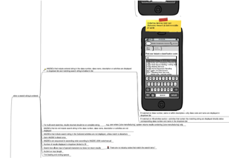
A snippet from one of the elaborated stories
Usability testing
After struggling to gain funding from the program, we managed to get approval to run two rounds of usability testing. The first test we ran was around the proposed screen flow and question set of the WC direct offering. As we had only previously sold workers through brokers and intermediaries we wanted to get a better understanding of whether the question flow was logical and understandable. For the second round of testing we tested the entire application with a focus on the newly tweaked ANZSIC lookup.
How we ran it
For recruiting participants we went through an agency providing them with a screener for recruitment. For the first test we ran the sessions as blind tests by removing any traces of branding. That meant pulling posters down putting up signs to cover signage. We did this to remove any brand influence or bias on the test. We were less strict with the second round.
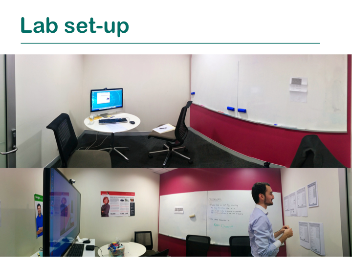
Test lab
Myself and a fellow UX Designer were in the room with the participant, taking turns facilitating the test and note taking.
Observation room
We live streamed the session to an adjoining observation room where we invited key stakeholders to watch.
Learnings
For the first round we made the mistake of spreading the testing sessions throughout the day, which meant we had to hold debrief on a different day. We rectified this in the second round by scheduling all the sessions in the morning and debrief in the afternoon. This worked a lot better as the insights from the morning sessions were still fresh in everyone's minds. Another lesson learnt was to ensure all required stakeholders are present to observe the tests as it impacted the time in getting the findings prioritised for implementation.
For the second round, we waited till the ANZSIC lookup for direct was built as that was the only way we could properly test its usability. This meant the timing of the testing session was late in delivery and we had to be particular about what insights were implemented. Though a lot of the findings were put to good use in future LSP releases.
Further, not having the support from upper level management meant we spent a lot of time trying to justify why usability testing is important and getting approval for funding instead of just getting on with the job and conducting it.
Benefits
WC Direct, an online portal to sell Workers Compensation insurance to the market, was launched in late November of 2014. It had a number of benefits for the business in that we were first to market (competitors weren't and still aren't doing it), was the first time GIO Commercial Insurance had a direct to customer offering, and the release formed the technology that all future LSP releases were to be built on.
Within the two hours of going live the first two policies were sold through the site, which may not sound like a lot but considering no marketing was yet to go out, it seemed like a great feat.
Packages direct online
November 2014 – February 2015
Overview
Upon delivering WC Direct, delivery for an online Packages (PKGS) presence began. Mobile Business Protect was a new product offering by GIO for mobile businesses and tradespeople who do not operate their businesses from a specific location.
The team and my role
Due to a new technological direction with PKGS, two new delivery teams were created, one to handle the Motor product flow within the app and the other to take care of the aptly named "Checkout" flow. UX became a shared resource amongst the streams of work of both WC and PKGS. I took the UX lead role for the PKGS stream, acting as their point of contact for any work that was required. My role entailed everything from analysis, wireframing, visual design to interaction design and prototyping.
The approach
We approached the UX work on this project differently. Using the learnings from WC, we highlighted the features that would require attention during Initiate and got to work on them early. We kept using Balsamiq for wireframing as it proved valuable when working across multiple locations. Something new we ventured into for visual design and interaction design was to build out some of the components into interactive prototypes using the existing styleguide as well as external libraries. This helped in conveying design ideas to stakeholders, in analysis and estimation of story cards and made the developers lives easier when it came to building and styling the various components.
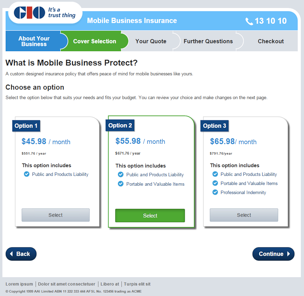
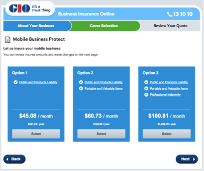
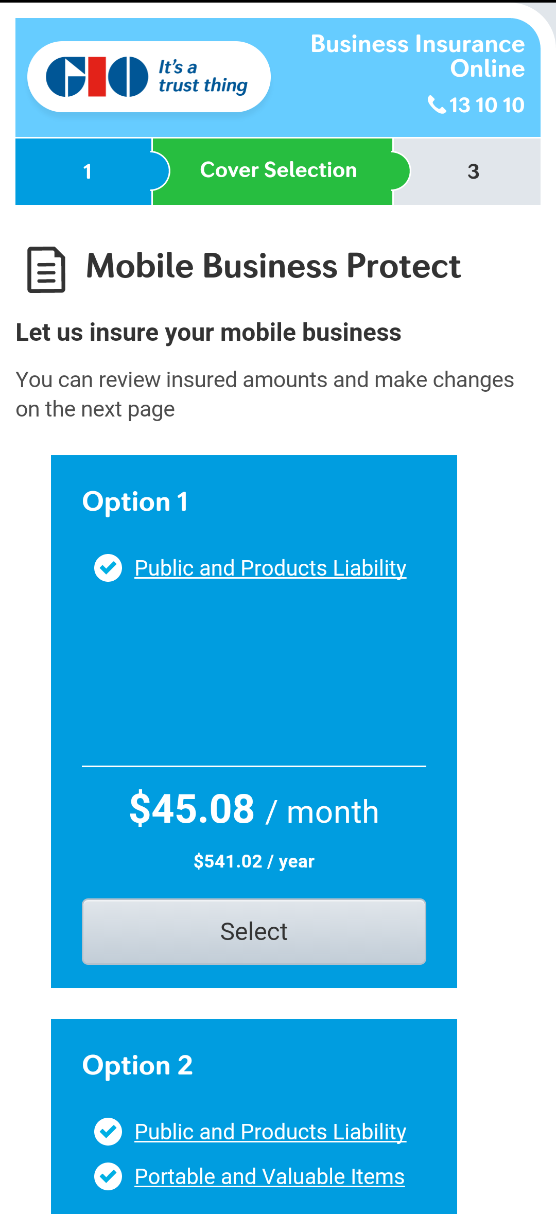
Cover selection
The Cover Selection page, presented above, was a screen with new components that were yet to be designed. The constraints we were working with were the usual scope, time and money, but also a restrictive style guide. We came up with two proposed options; the one on the left was a version where for mobile the panels would stack on top of each other and the one on the right, if time persisted, a carousel selection view. To get a better feel for both designs, I spent some time building out a working prototype using HTML, CSS and JS. I had help in getting the carousel to work from an experienced front end developer.
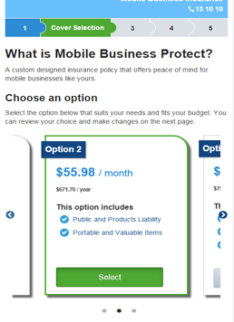
Screenshots of an early prototype I built
As with projects on tight deadlines, the version that would take the least amount of effort was selected and delivered, as seen below.
Going live
Before we went live, ideally we would have liked to have conducted usability testing on the new features we built. There were always talks of conducting sessions swirling around but ultimately getting funding from the program proved difficult.
Despite this Mobile Business Protect was well received when it went live in early May 2015. It was a first to market in the packaged insurance world and as of May 20th, 2015, over 200 policies of the new product offering had been sold.