Broker Digital
Designing a market-leading digital experience for ING mortgage brokers.
Overview
ING mortgage brokers and their support staff currently write 85% of ING's mortgage business each year. Historically, ING has primarily competed on price to grow its mortgages portfolio which is unsustainable in a competitive environment.
ING with its strong customer advocacy (NPS) and broker affinity as a true challenger brand and alternative to the major banks, had an opportunity to successfully shift from a "price led" proposition to an "experience led" proposition by delivering a market leading digital capability, driving greater efficiency and empowerment for the broker and improving the broker and customer experience interacting with ING.
The current digital experience for brokers (via the existing broker website), did not meet the basic broker expectations of a digital bank and was not aligned to the experience offered to customers via the direct website.
The problem
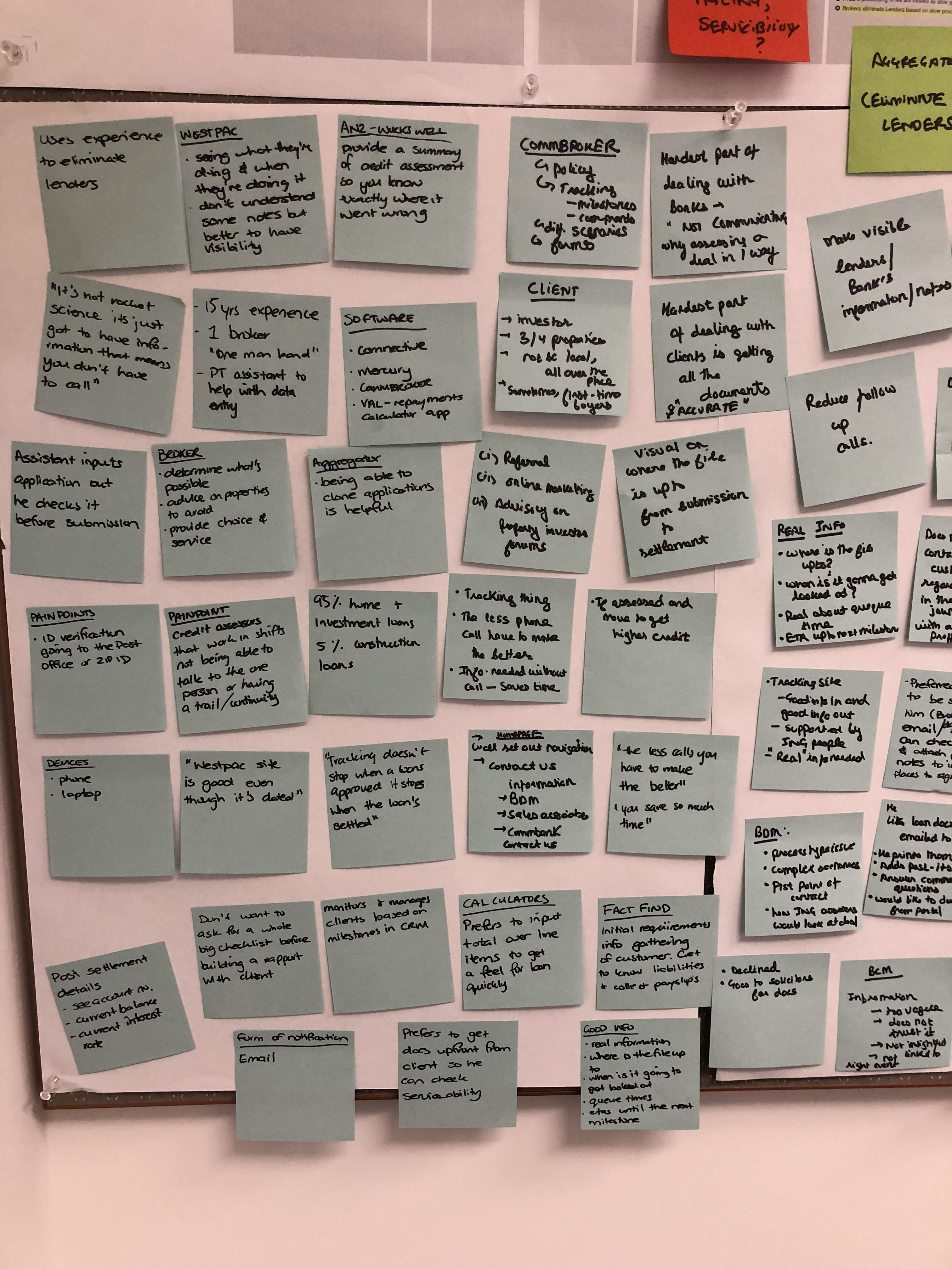
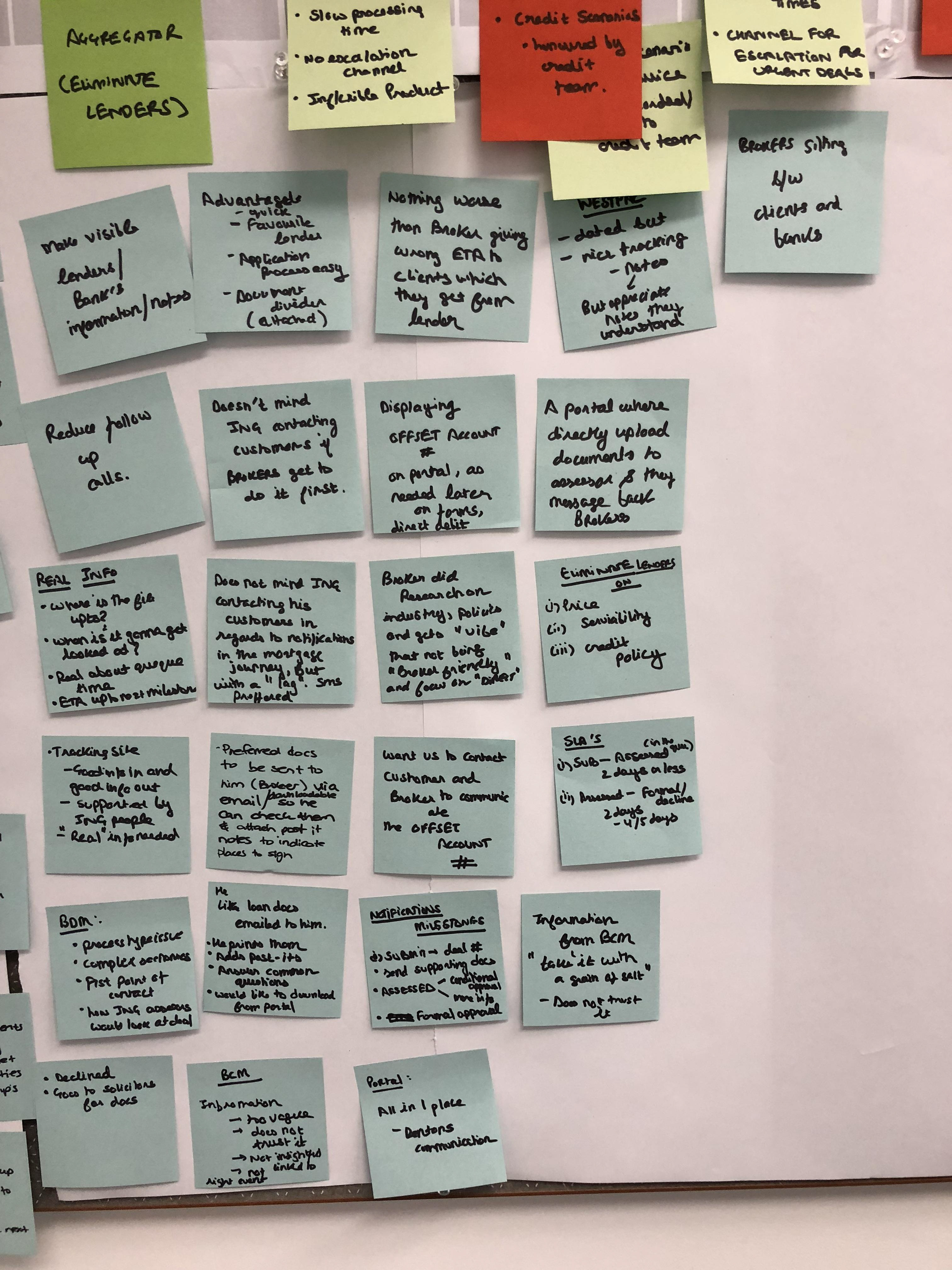
Brokers are generally time poor and constantly seeking ways to increase efficiencies when dealing with lenders enabling them to write more business and provide a better service experience for their customers. Additionally, brokers are always "on the go" and need access to information anywhere, anytime.
ING fell well below market parity with brokers expectations in this space and therefore, beyond pricing considerations, brokers prefer dealing with other lenders who simply make their lives easier.
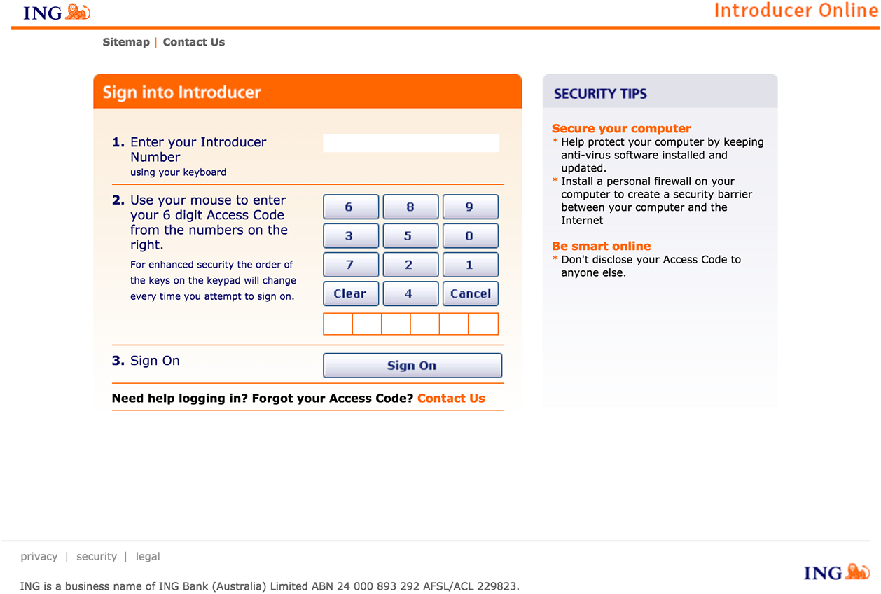
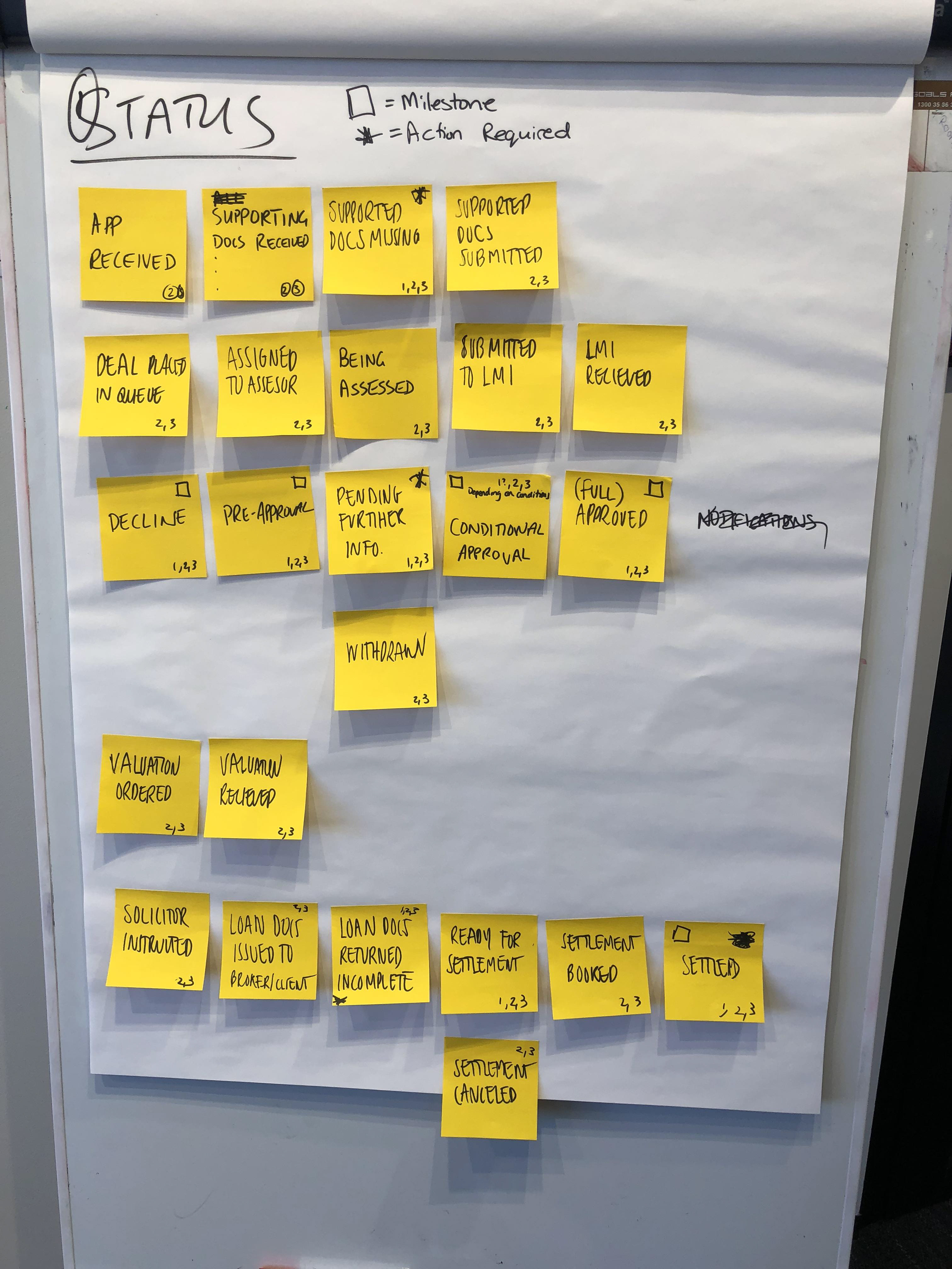
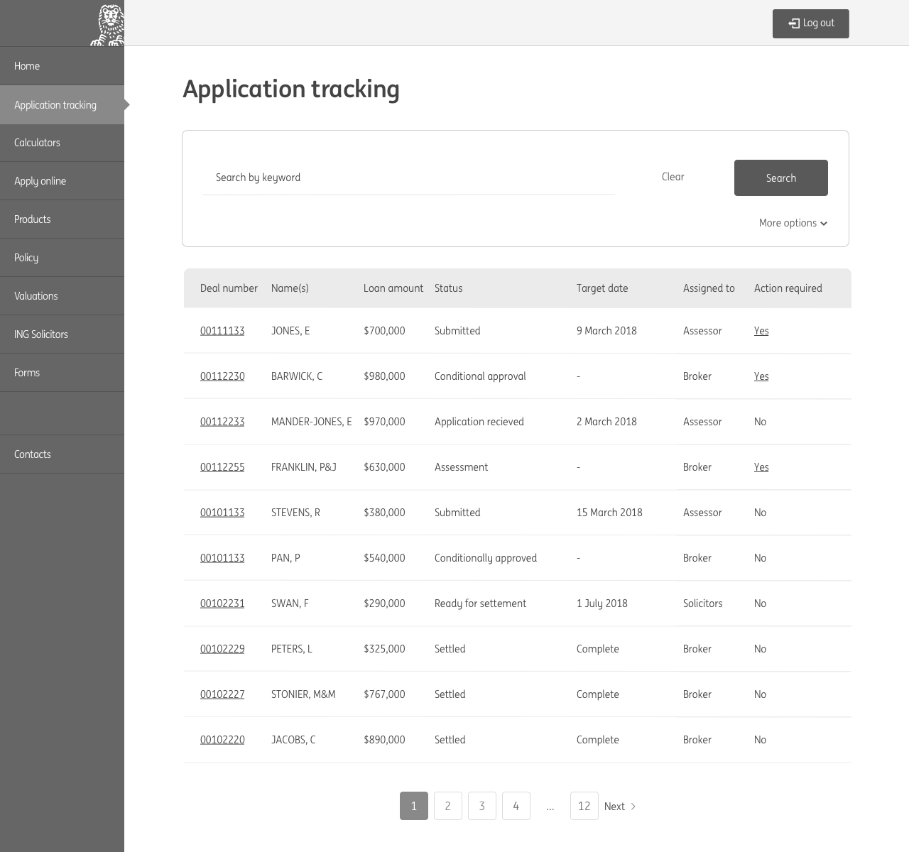
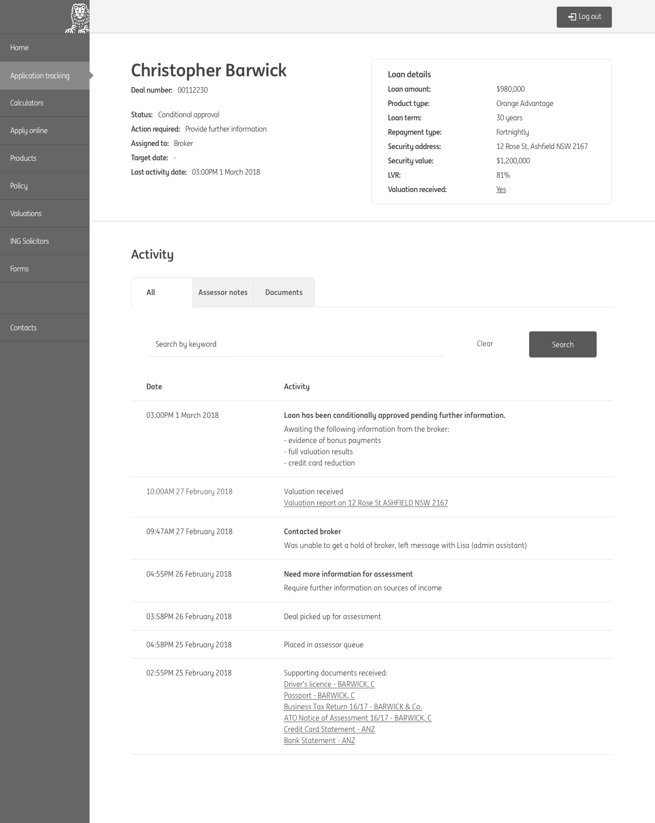
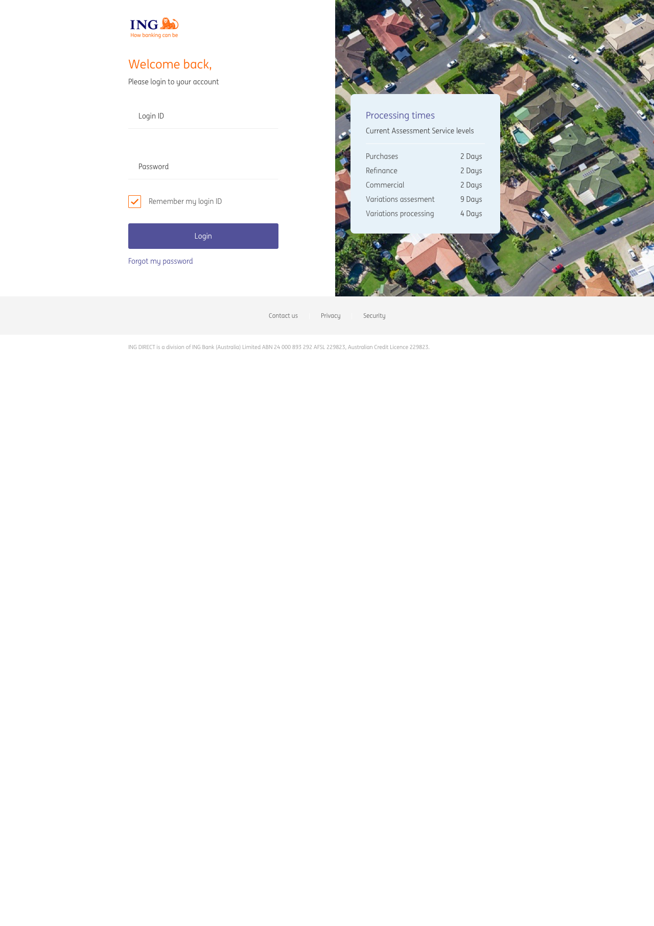
An example of the poor broker experience was reflected in the loan tracking capability which is critical to a broker in supporting their customer through the mortgage process. Loan tracking was unavailable on the broker website since the introduction of a new system in May 2016. Brokers only option to track deals was either via Back Channel Messages (BCMs) with limited information/access or contacting the Sales Support Unit (SSU) and waiting up to 45 mins to speak to an ING representative. Customer Operations SLAs had blown out up to 20 days in the past, increasing the importance for brokers to know how their loans are progressing.
The goal of the Broker Digital project was to deliver a market leading broker portal that empowered brokers to manage their application pipeline and client portfolio with ING, anywhere, anytime.
The plan
As the lead UX designer, I was tasked with mapping out the design strategy for the project. I first listed out the tasks that needed to be done, then mapped them to tentative project timelines.
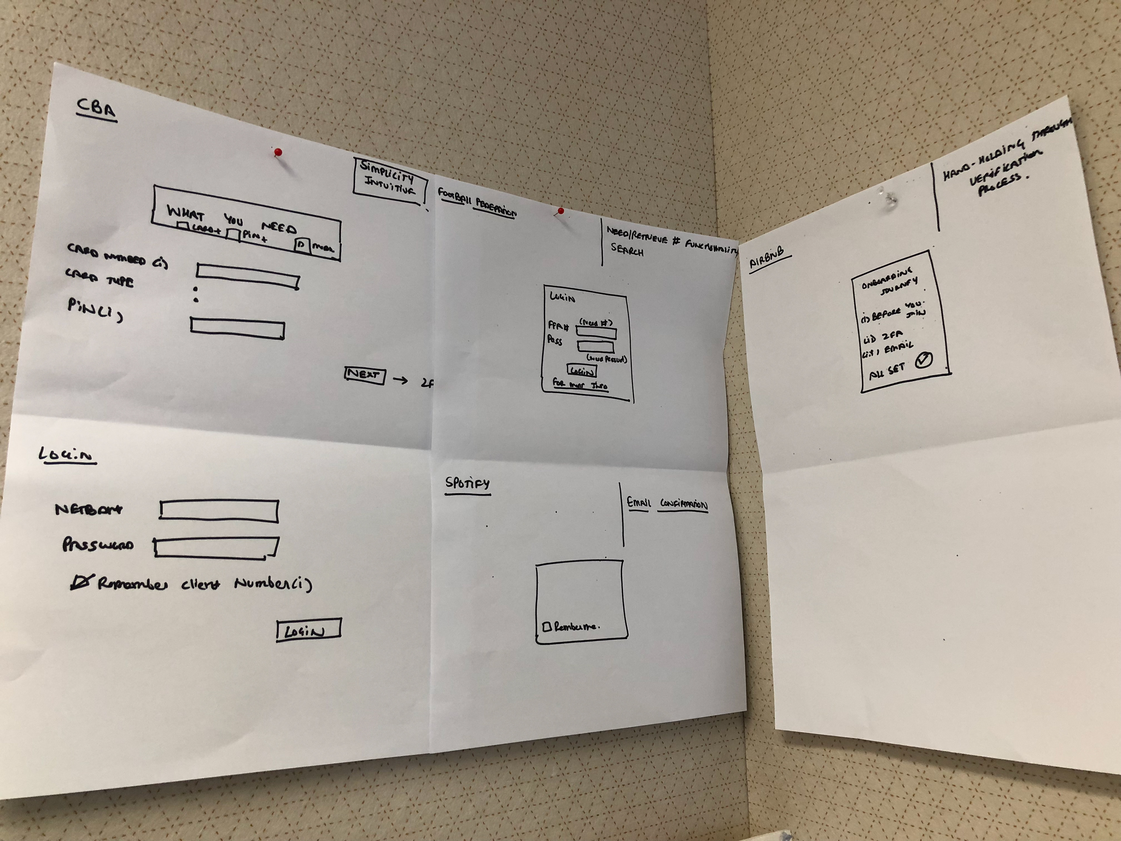
Research
In 2014 an external agency had been hired to conduct research on the broker market. I used this research as a starting point to acquaint myself with the broker space. I walked through the customer journey with stakeholders to see if it still held true, then simplified it into a high level customer journey that was easily digestible.
Stakeholder and broker interviews
Next the Product Owner and I arranged interviews with key business and project stakeholders to get a clear understanding of the business outcomes and vision for the broker space. We then arranged interviews with brokers to understand their current process and pain points to develop a deeper understanding of our target users.

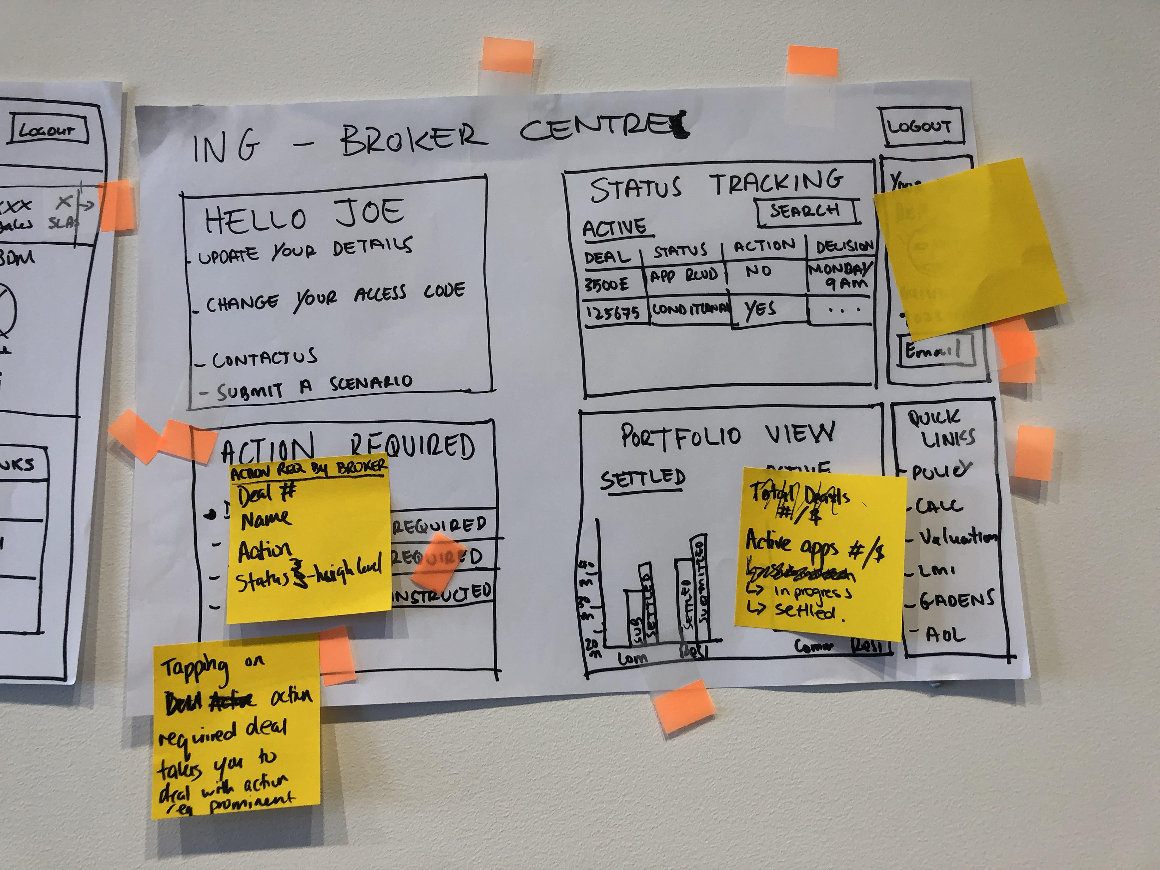
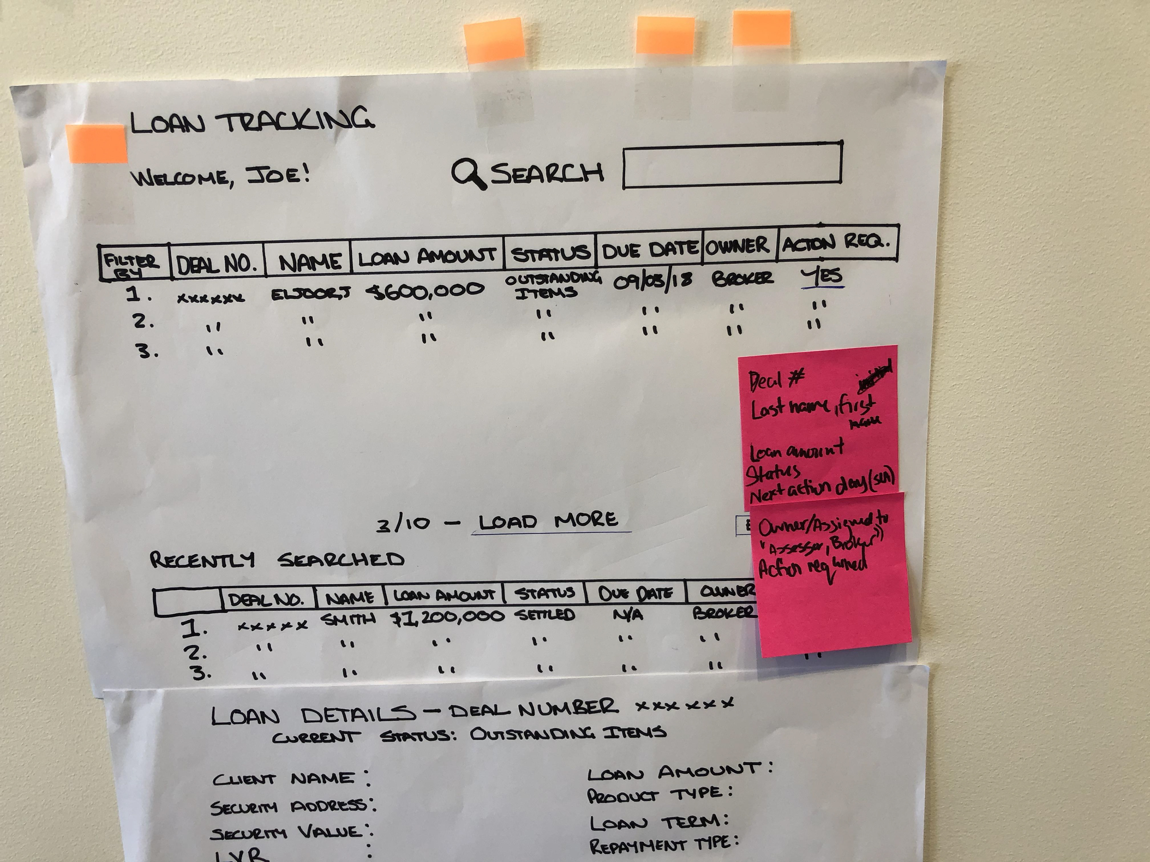
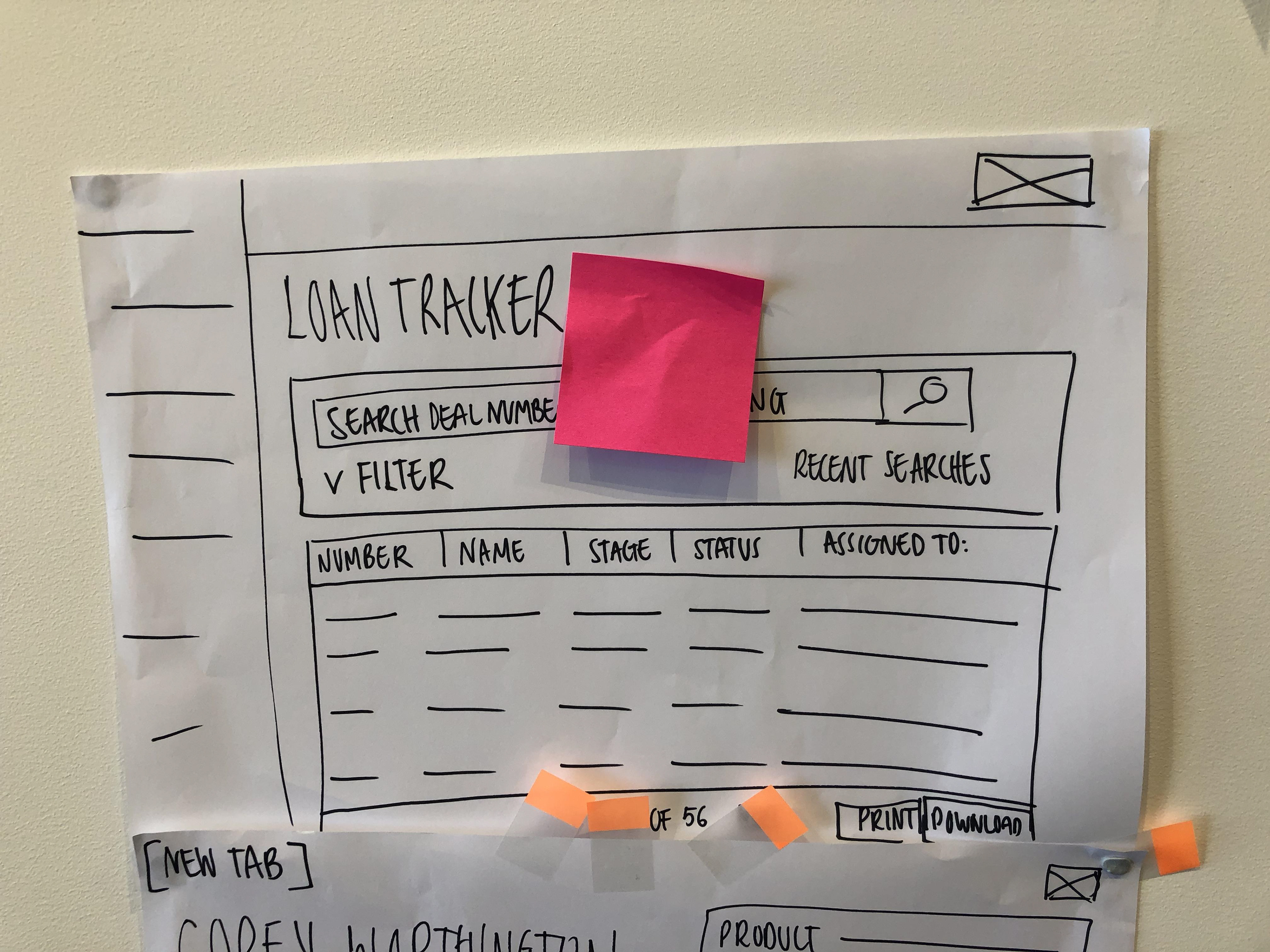
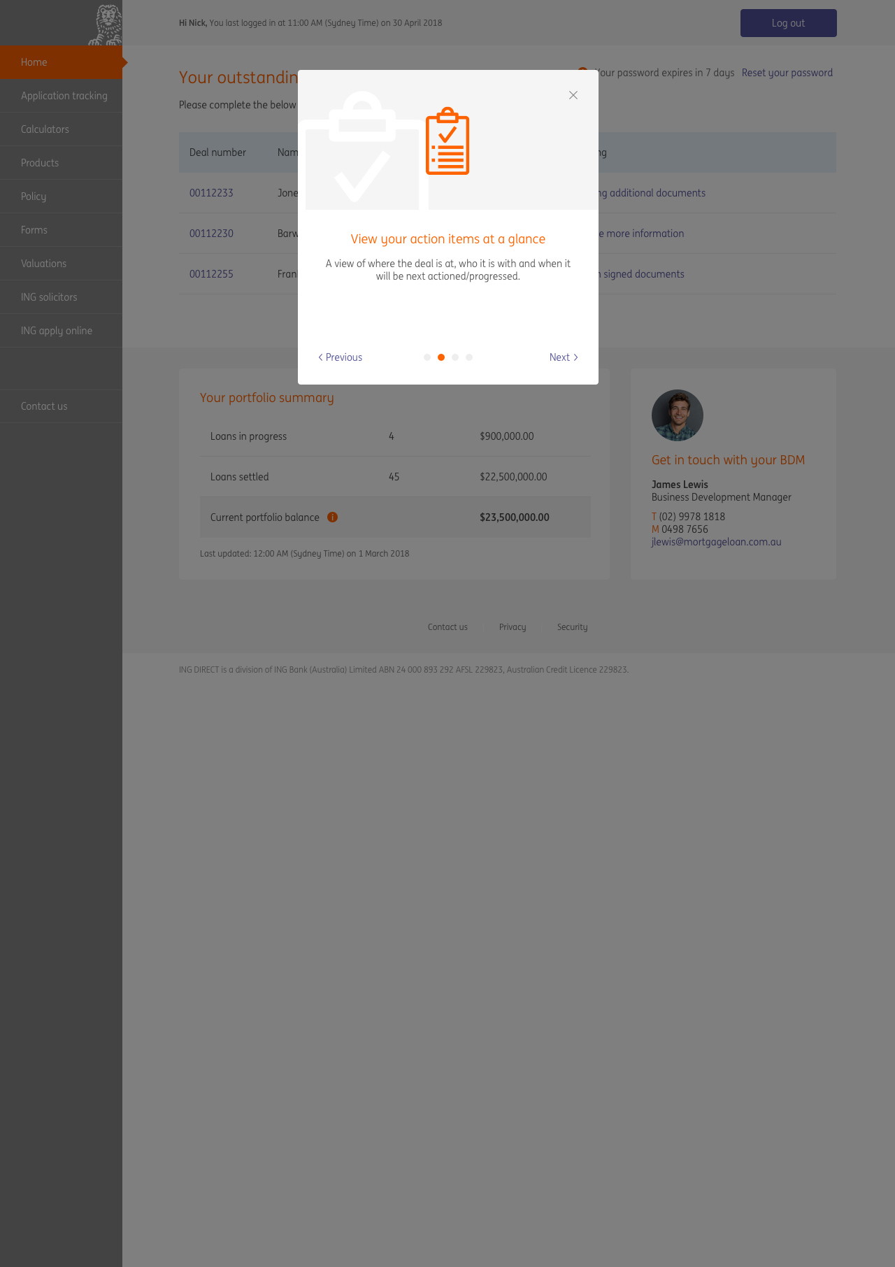
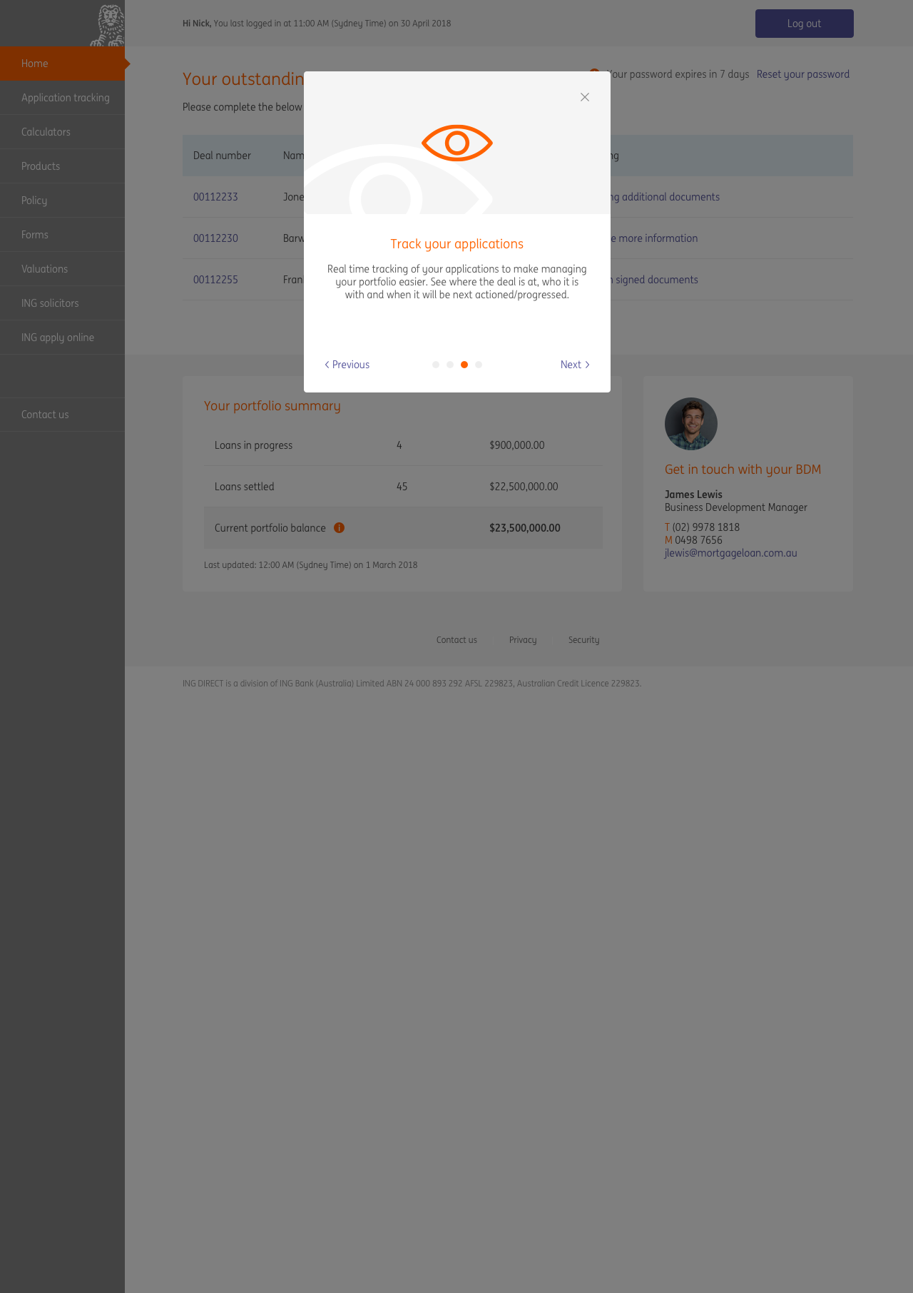
Design sprint - Pipeline tracking and password reset
We kicked off the project by holding a design sprint/ideation workshop for the first epic, Pipeline tracking. We invited all the relevant stakeholders and began by running them through the simplified journey to confirm its accuracy. The first day was all about establishing the vision for the project and gaining a common understanding of the current lay of the land.
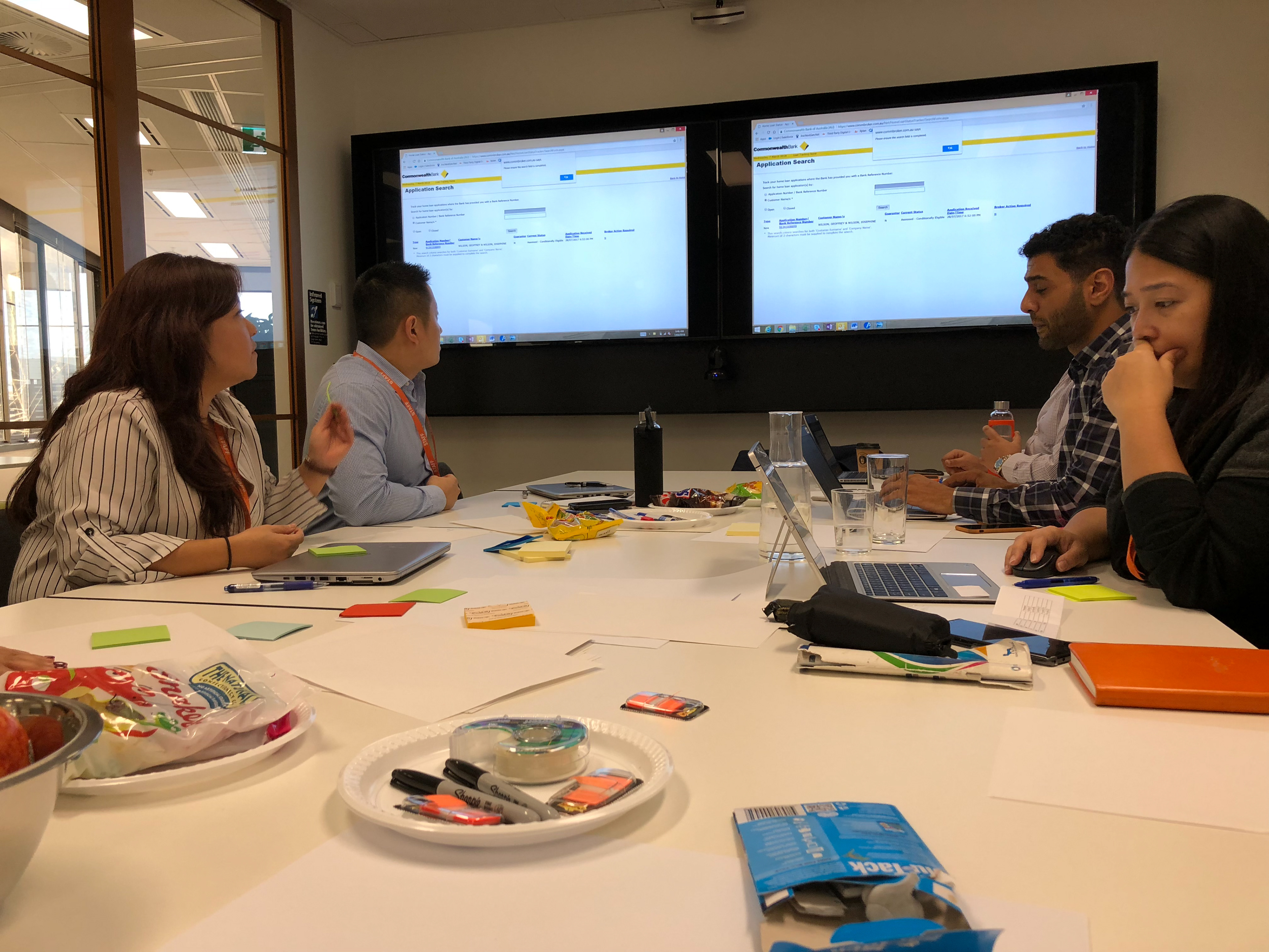
The second day we got to sketching and voting. We iterated till we settled on a couple of solutions that we could refine and take to testing. I found that the design sprint workshops were a great way to flesh out features as we had all the right people in the one room, saving time from running around to find the right person to answer something.
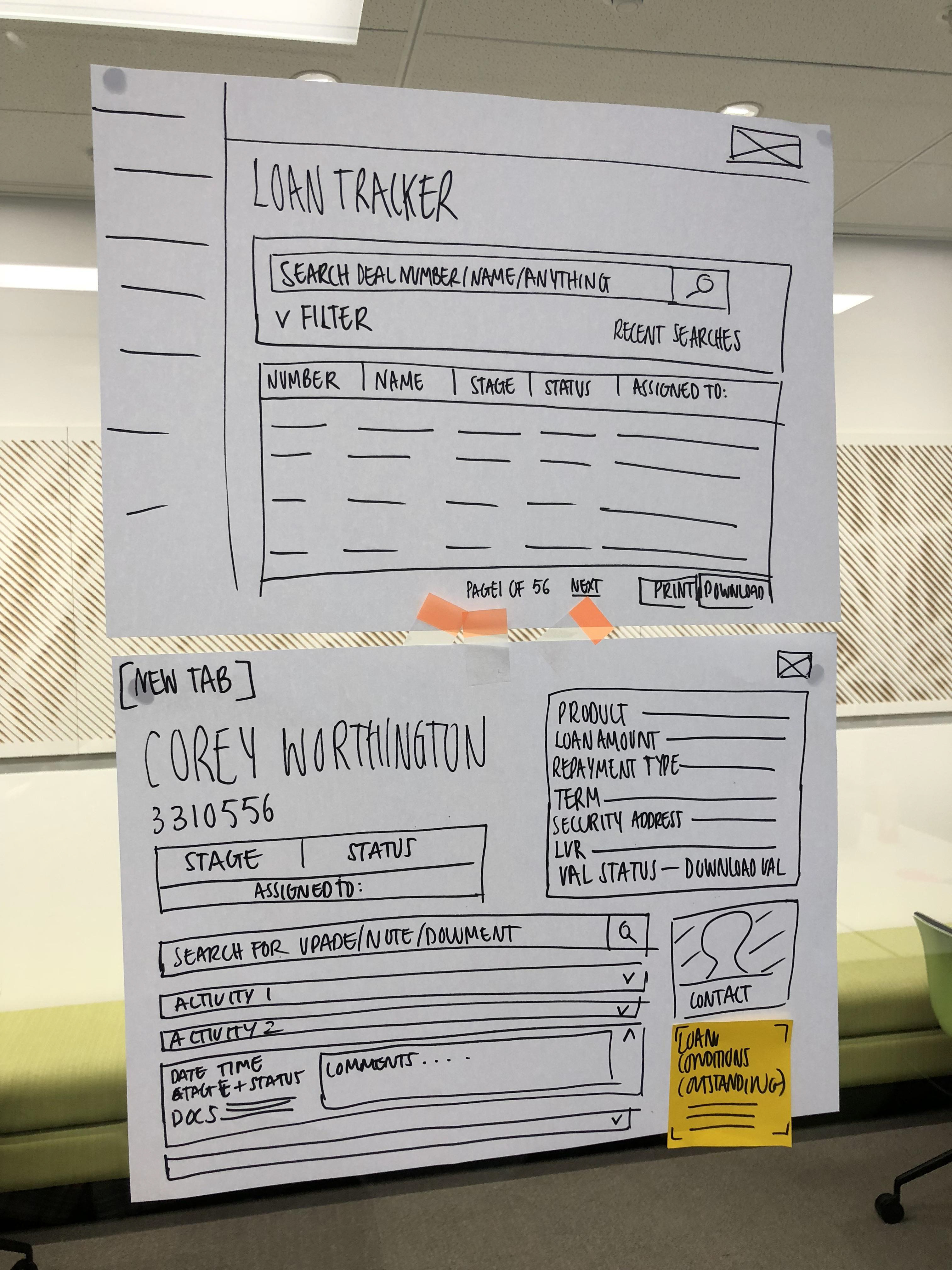
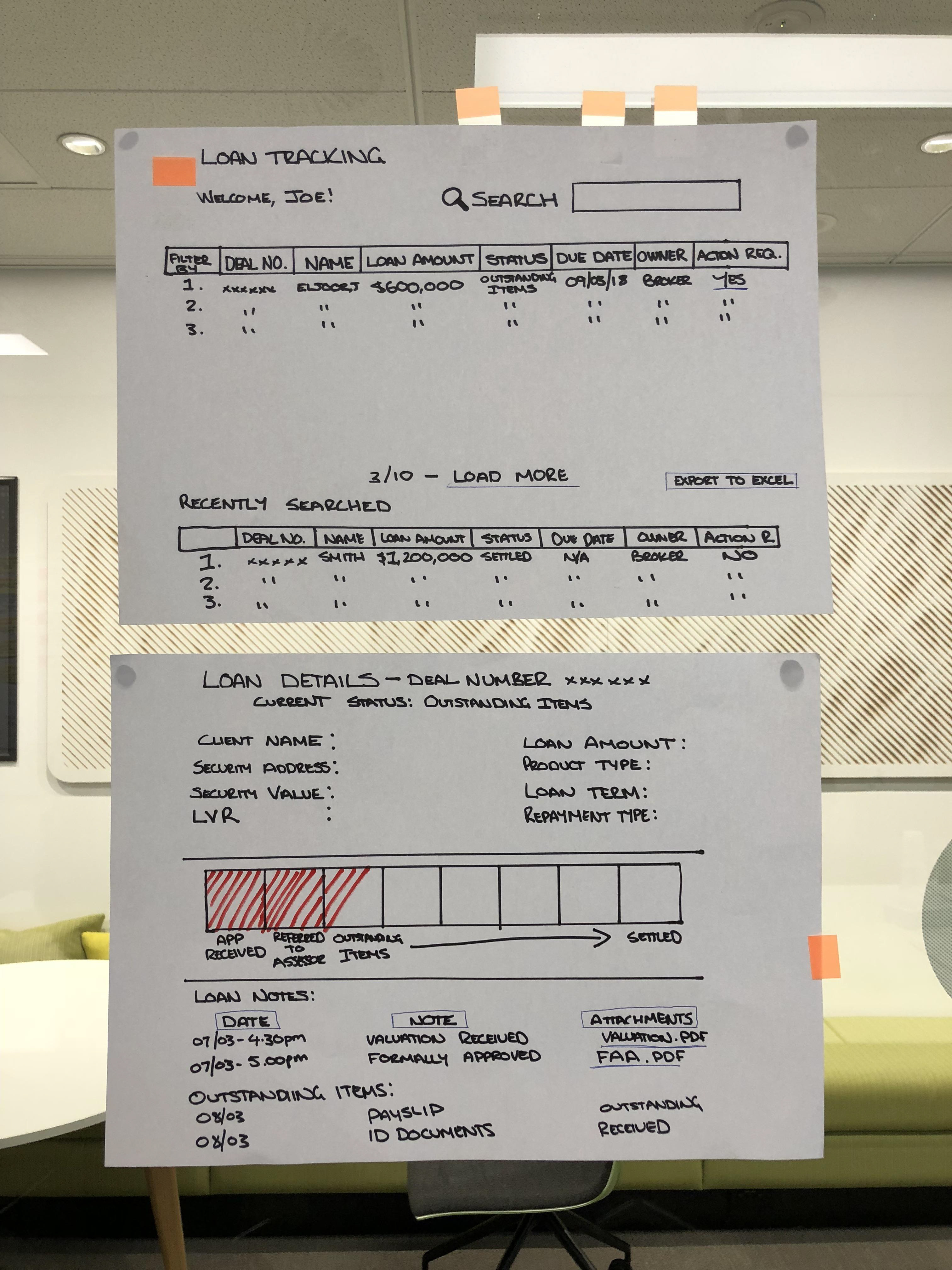
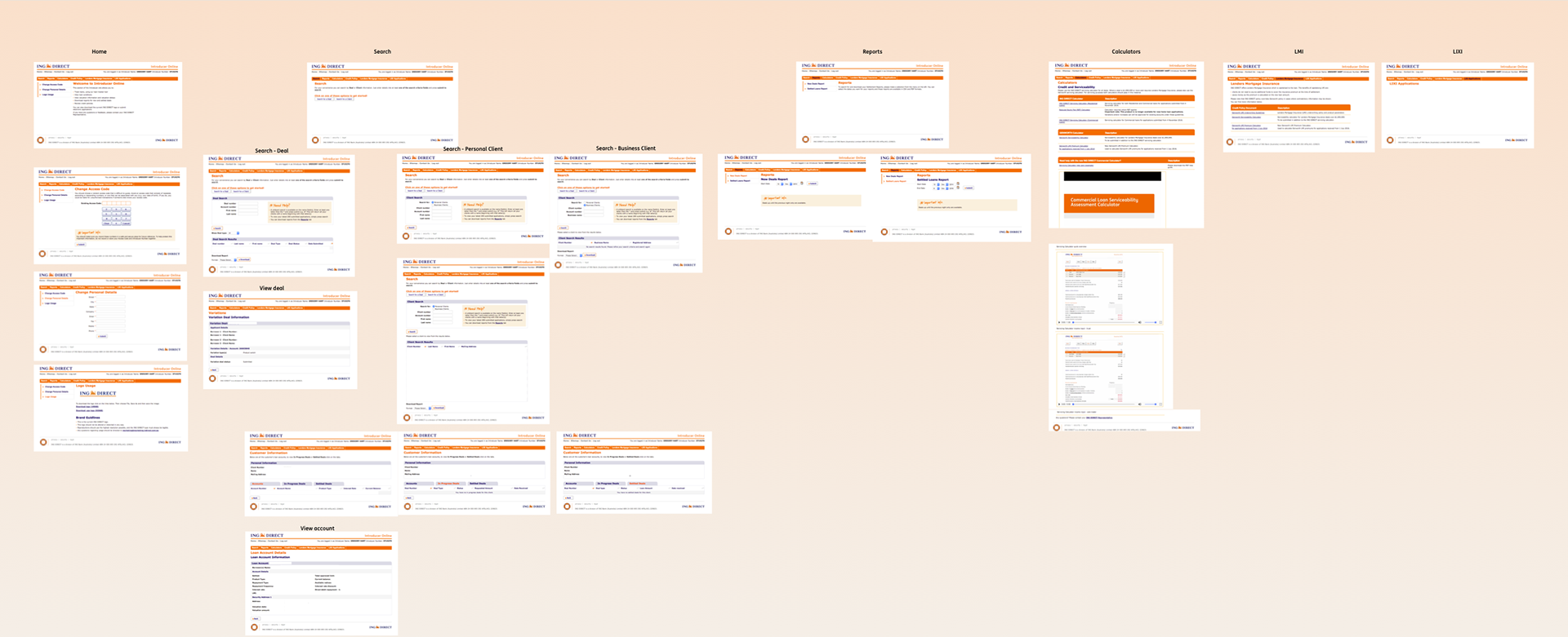
I then translated the sketches into a clickable prototype using Sketch and Invision. In preperation for usability testing I started writing the test script and setting up the equipment for testing.
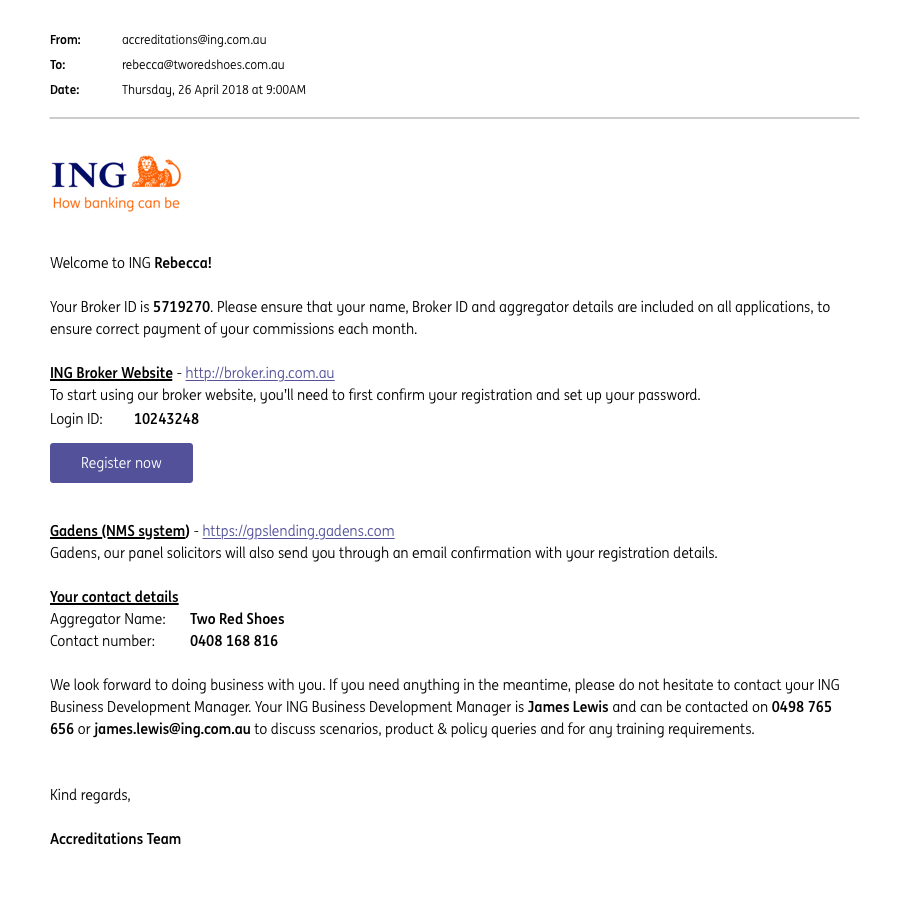
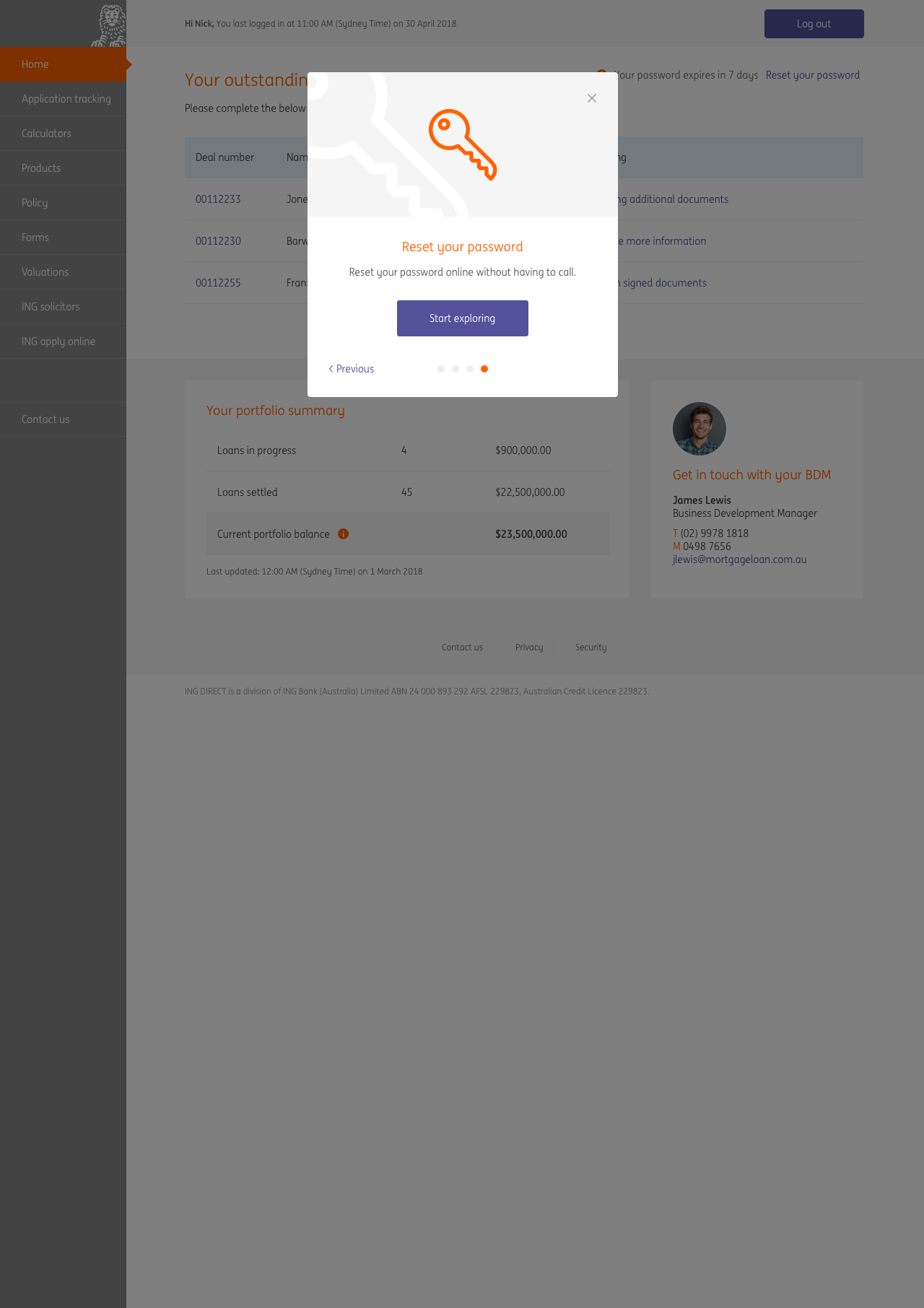
Change in scope
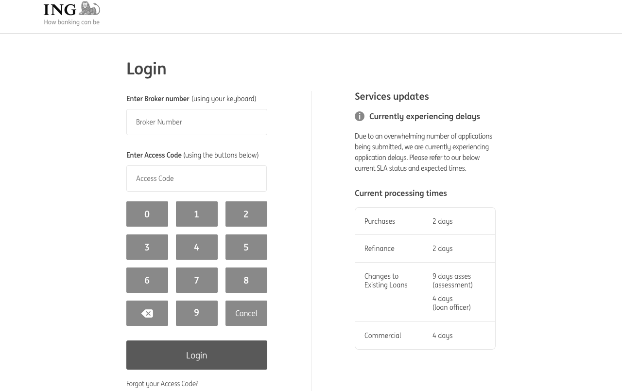
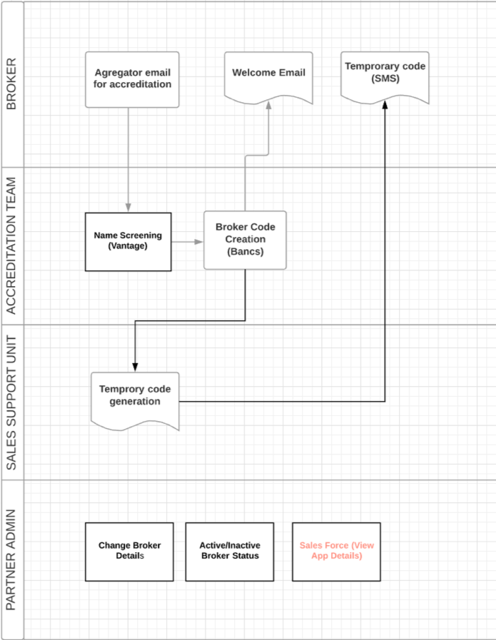
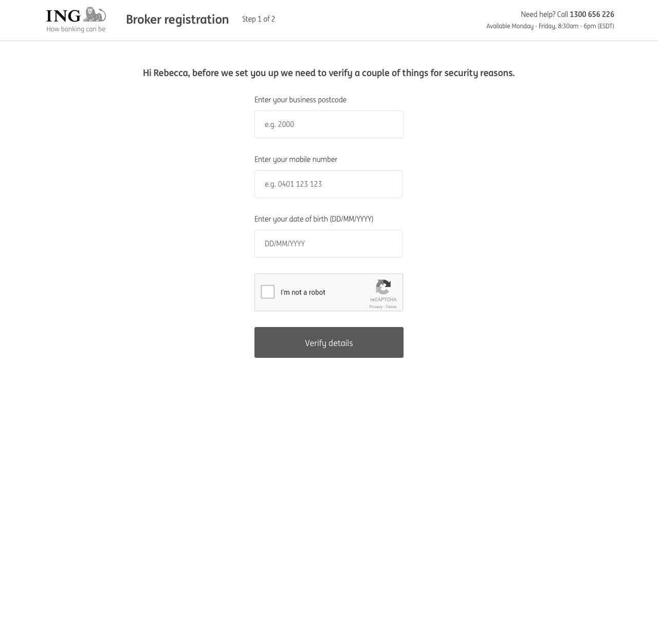
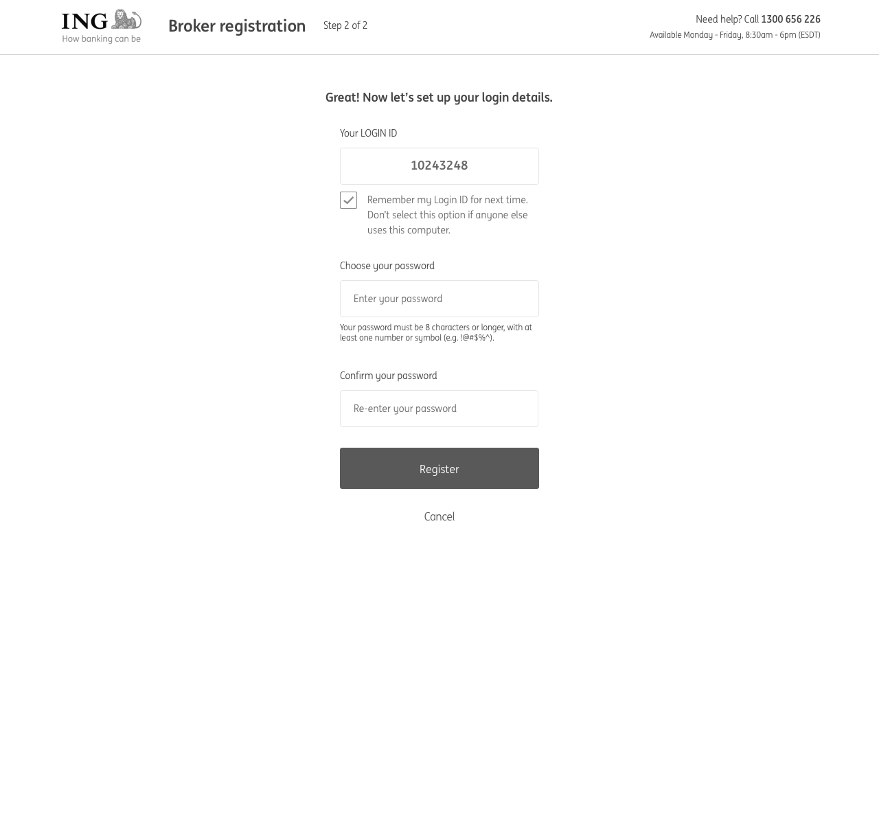
In the middle of usability testing we were informed that the scope had changed due to security and technical requirements. We had to incorporate an on-boarding process to allow brokers to register to use the portal. With the proposed architectural solution, a broker needed a Login ID in addition to their existing Broker ID. We identified this as a key design problem, as we predicted there would be confusion around the two numbers as to when to use each one. To figure out solutions we held another design workshop.
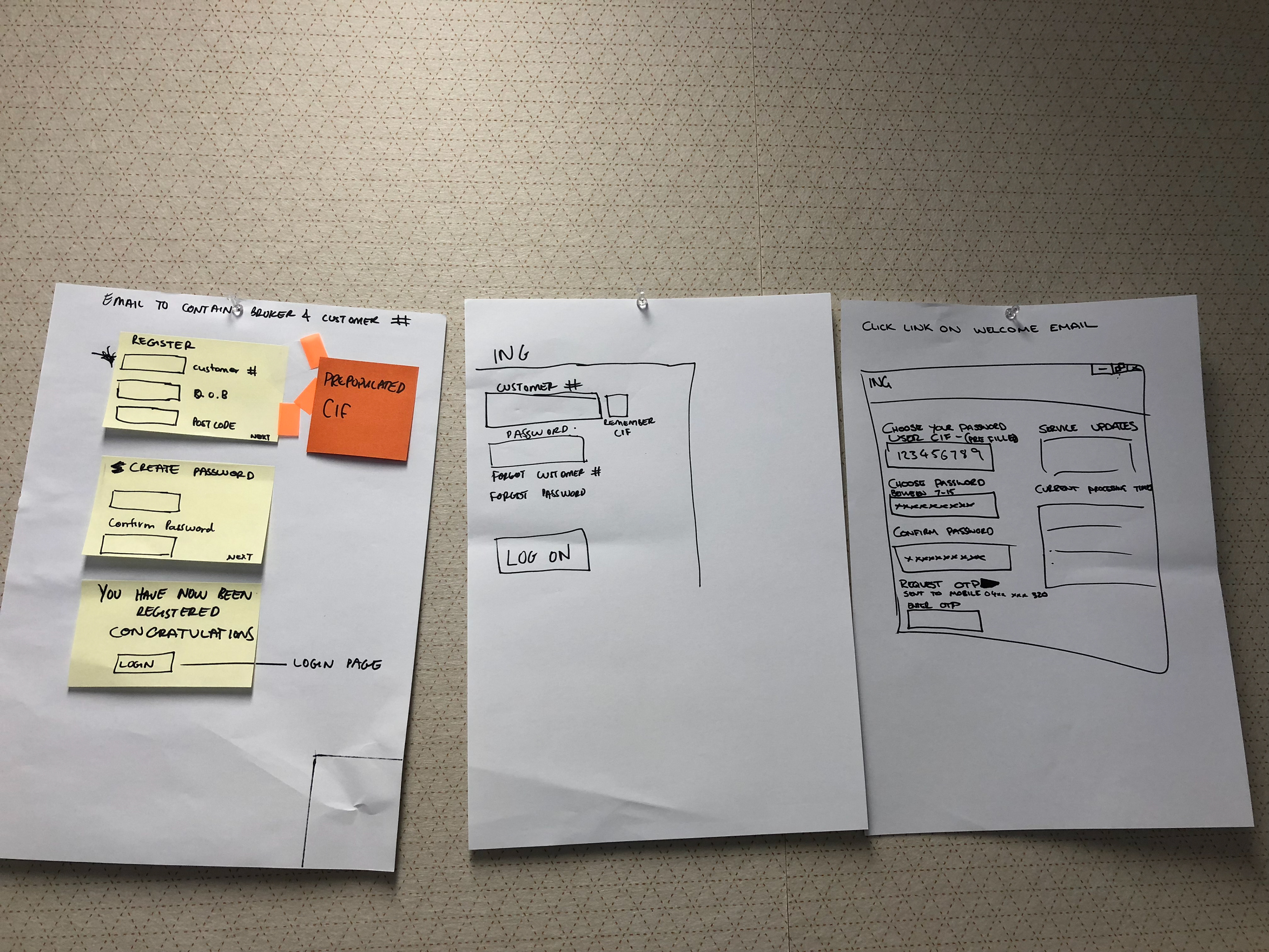
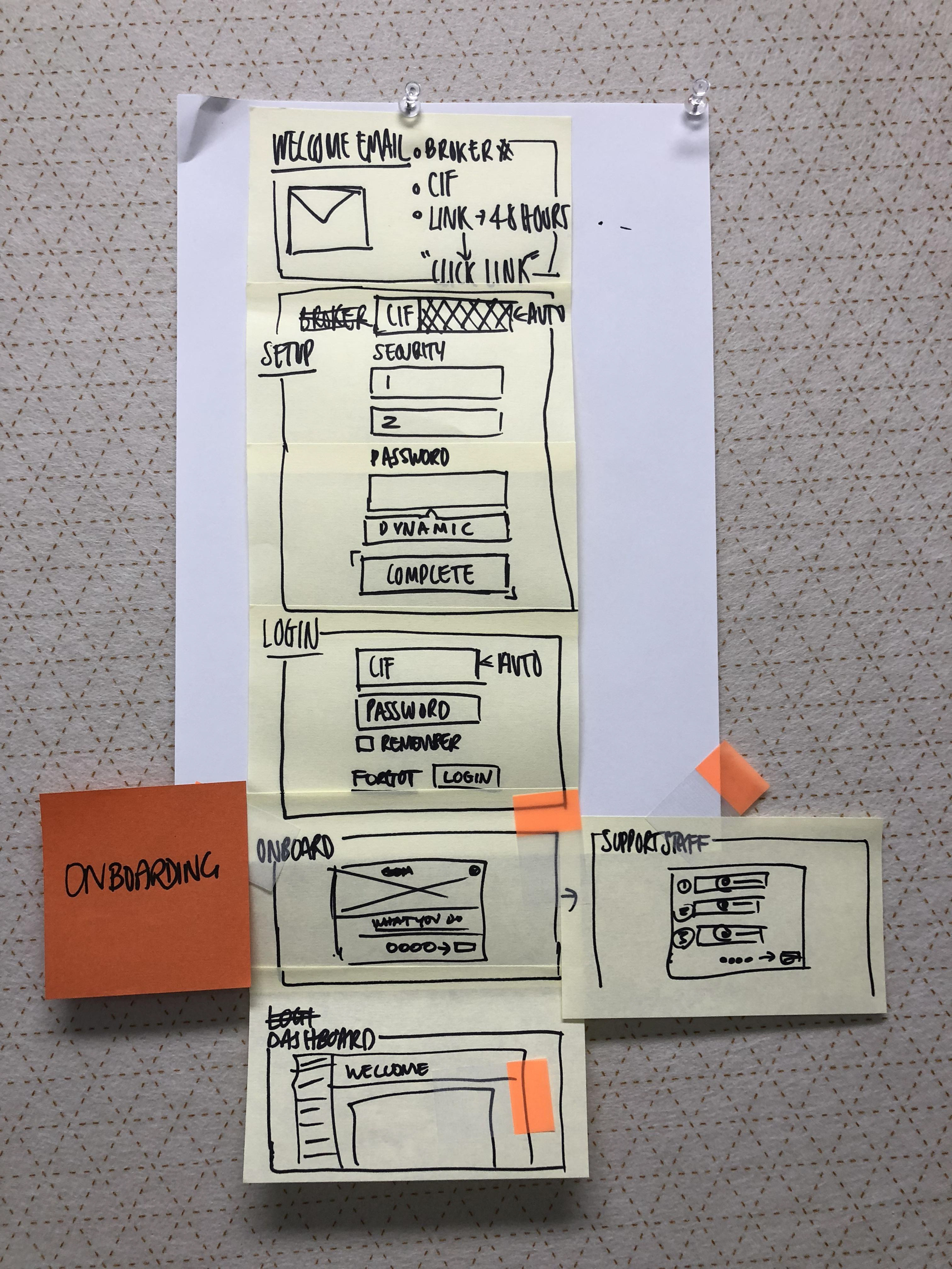
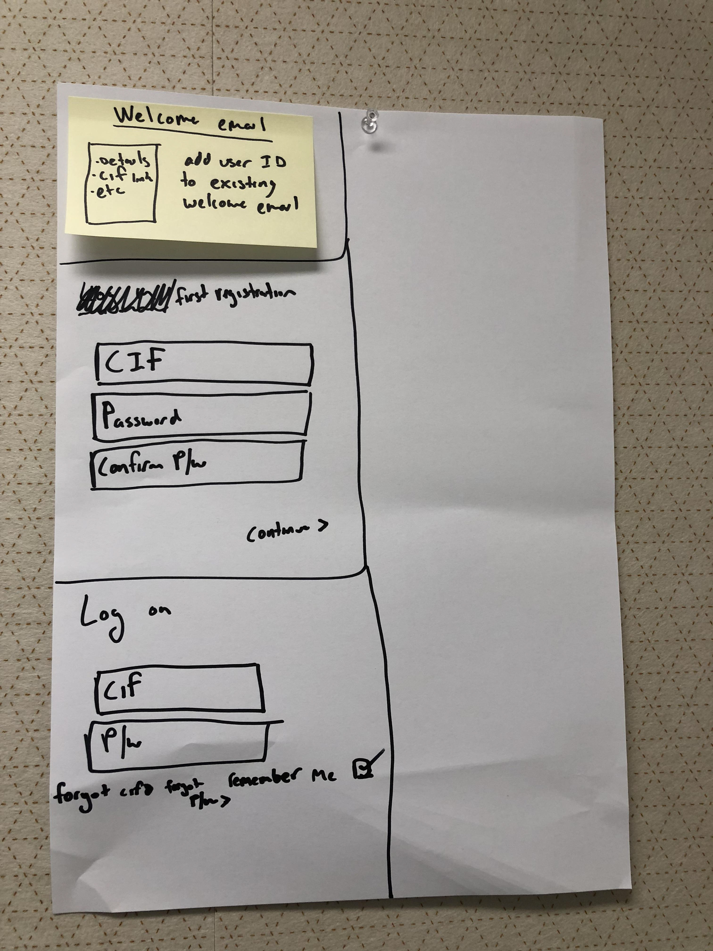
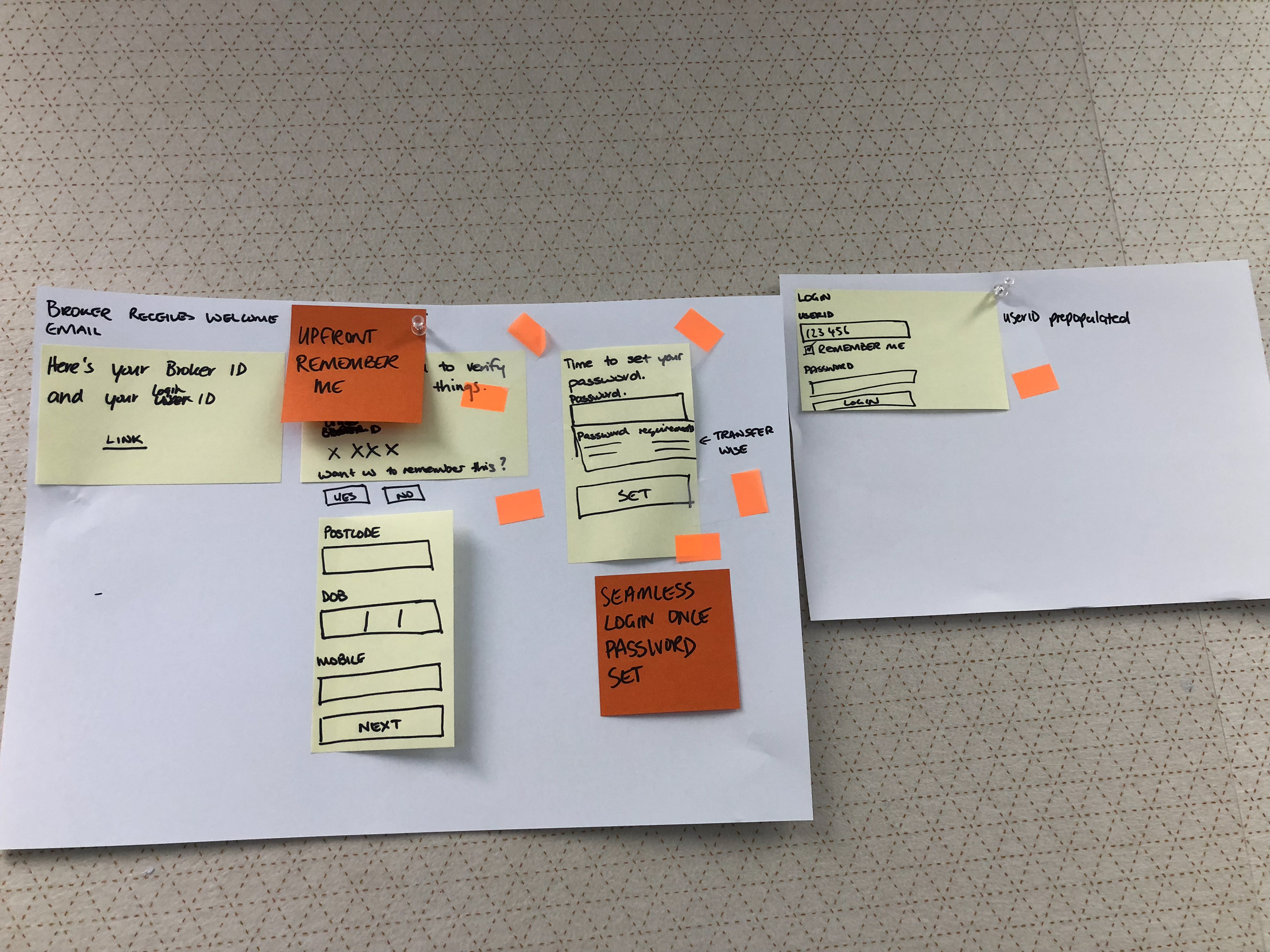
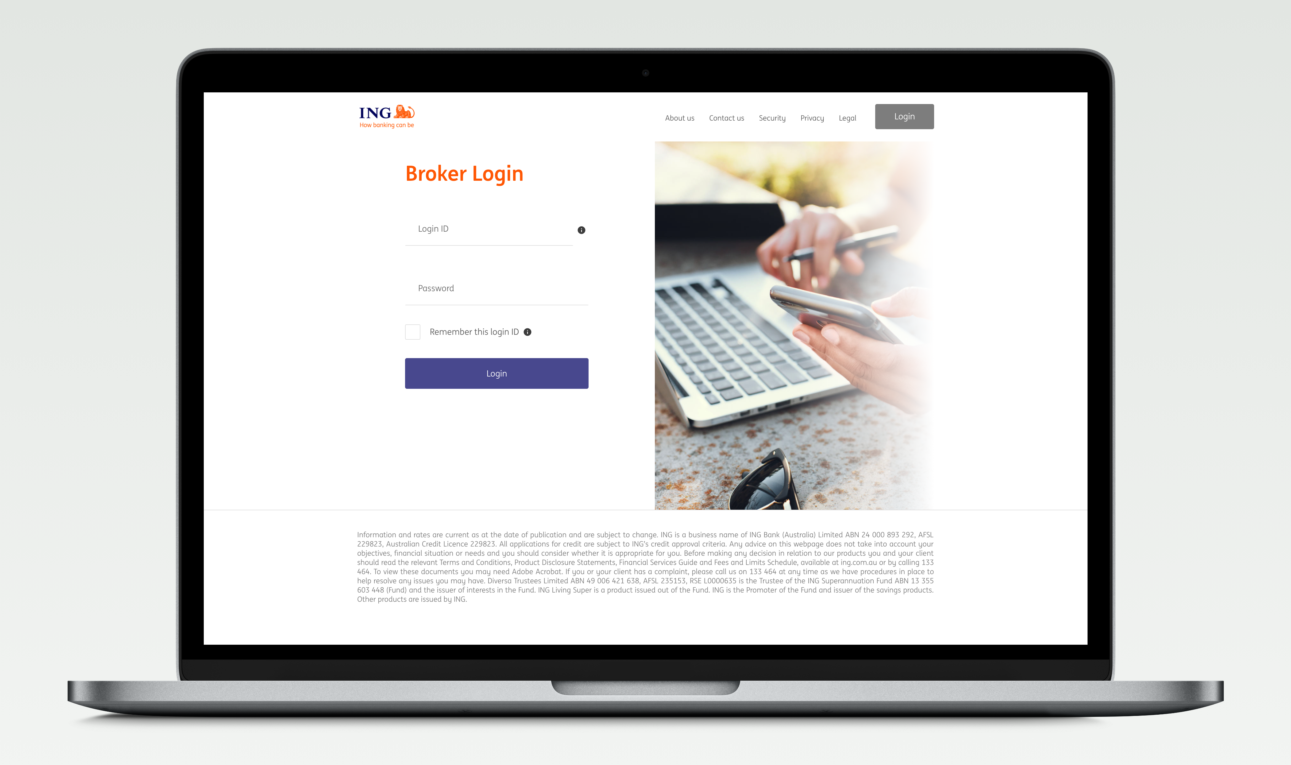
Again, I translated the sketches into wireframes and a clickable prototype. A potential solution to the two number problem was the "Remember me" functionality. By enabling this, the browser would persist the ID at every visit. Another small win we had was the replacement of the numeric keypad for passwords with an alphanumeric password. This allowed password managers to store the login information (we pushed risk and security to get this) making it easier to login.
Usability Testing - Round 2
For the next round of testing we wanted to understand what brokers currently go through in registering with a lender, test the new on-boarding process, gauge reaction to having to remember a Login ID for the portal which is separate from their Broker ID and retest the login process and clarity of the proposed portal design with the visual design applied. At this point a user researcher came on board to assist with the testing. We tested with 5 brokers, all from varying backgrounds in age, experience and tech savviness, and we took turns in being the facilitator and notetaker.

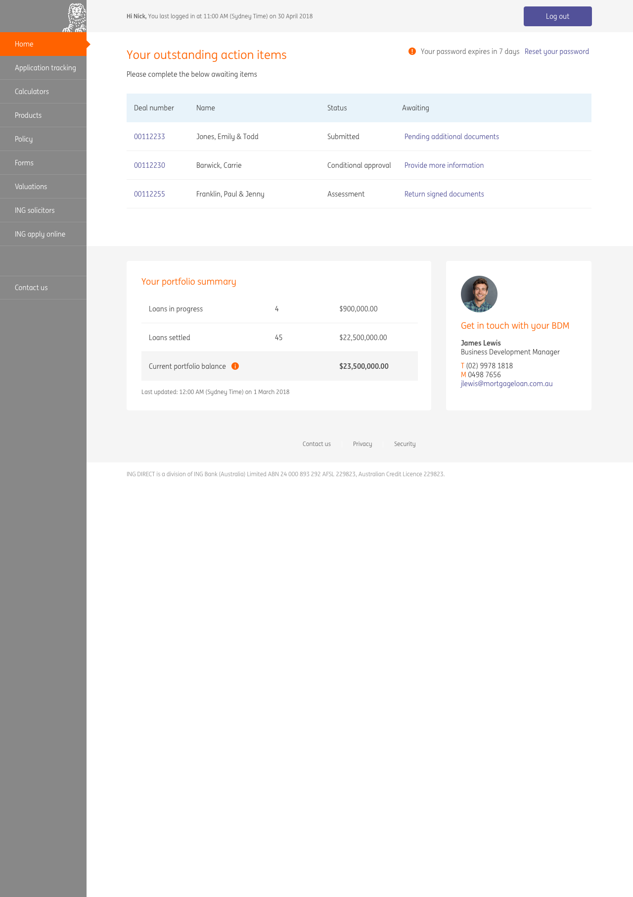
The general feedback on the entire process was that it was very easy. However, as predicted there was some confusion over the Login ID vs Broker ID. When participants were presented with the Login ID screen they assumed that the Login ID was the same as their Broker ID. When we probed them further on having two numbers the general consensus was "why do I have to remember an extra number when I'm not editing or transacting, but if I have to then it is what it is".
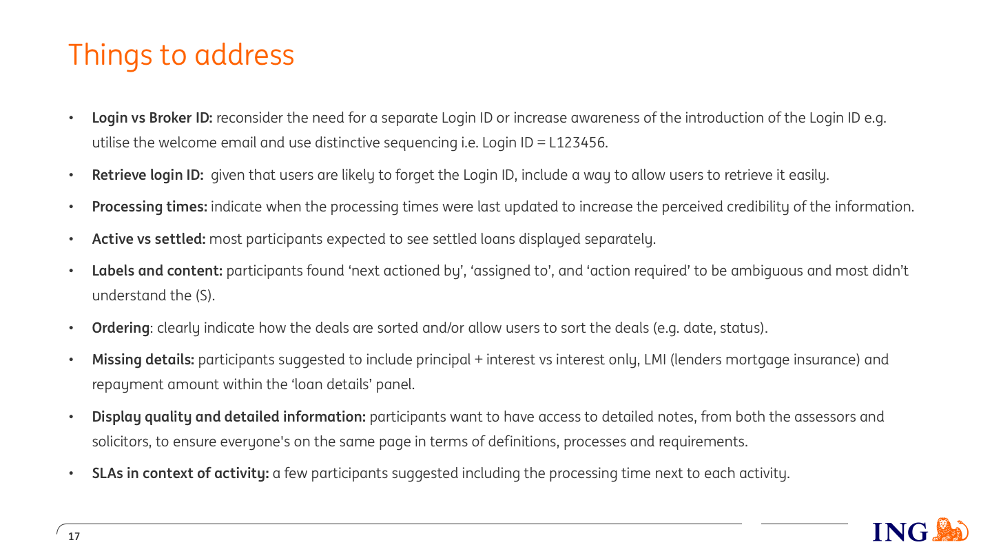
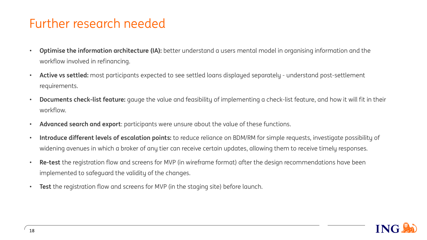
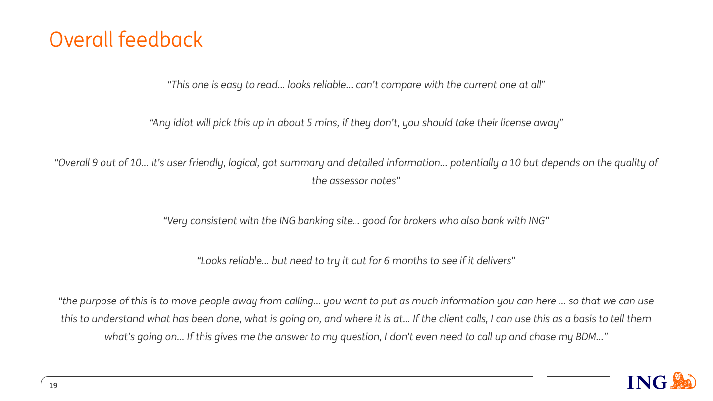
I created a slide pack to share the testing results. Below are excerpts that detail the findings.
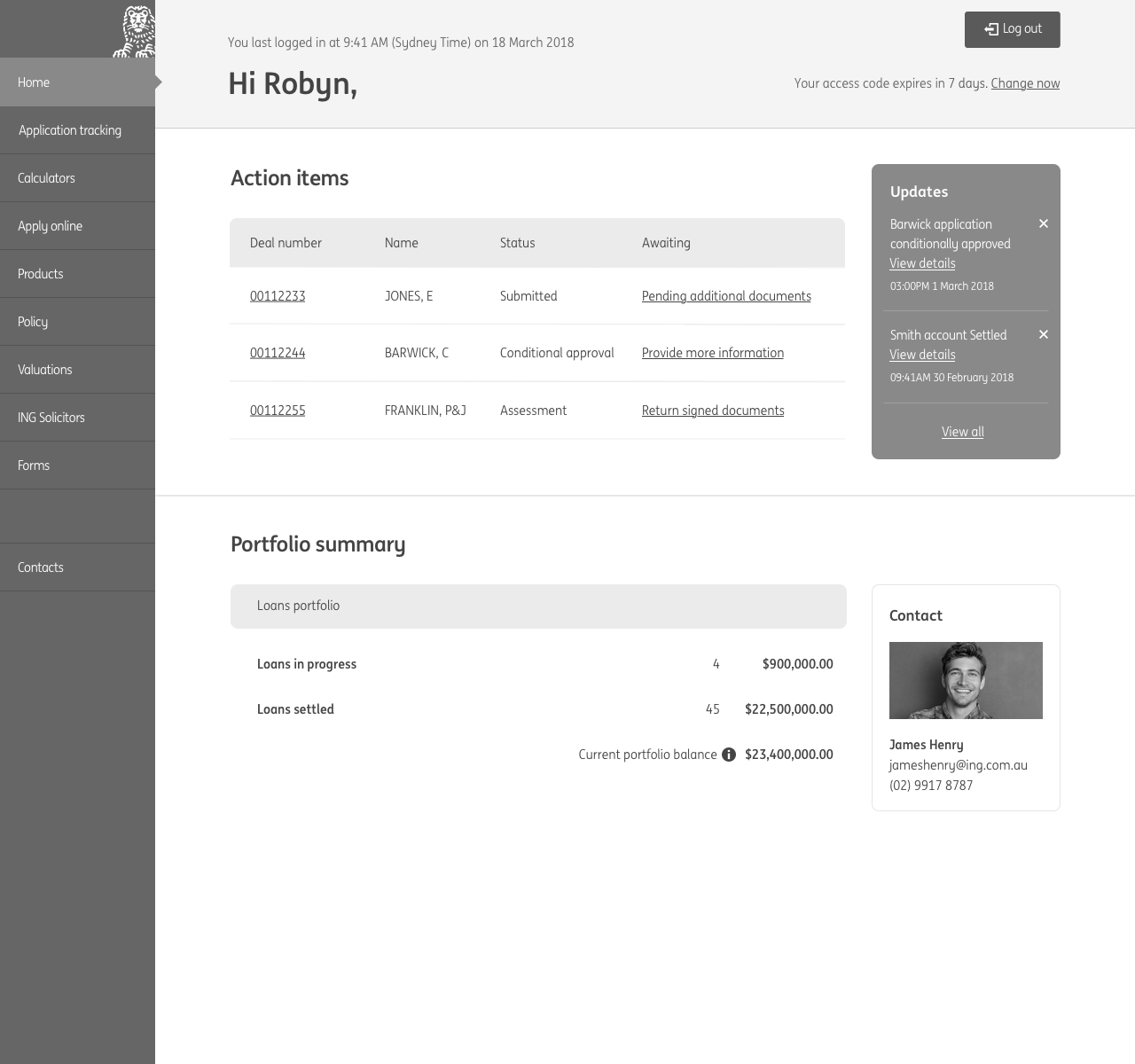
MVP release
On August 29 the broker portal was released to a select number of brokers to get some early feedback. Below are some initial reactions to the portal.